Introduction
This is an advertisement for a fictitious energy drink I created. I had never created a
3D-animated product commercial, so I wanted to give it a try. Throughout the process, I followed a Gantt chart and a master checklist that I created for myself. This project demonstrates my ability to generate ad campaign assets for a brand, like digital product advertisements. It also demonstrates my skills in 3D animation and visual communication.
3D-animated product commercial, so I wanted to give it a try. Throughout the process, I followed a Gantt chart and a master checklist that I created for myself. This project demonstrates my ability to generate ad campaign assets for a brand, like digital product advertisements. It also demonstrates my skills in 3D animation and visual communication.
Planning
First, I created a Gantt chart to follow throughout the process and developed an energy drink brand from scratch inspired by brands like Monster and Red Bull. The word “rowze” is a modern, trendy spelling of “rouse,” as in awaken or initiate, which I thought would be perfect for an energy drink name. I also added “energy” after this name to make it clear that it’s an energy drink. Then, I developed a company presenting this drink. I came up with “VOLTIS” because it sounds energetic and makes me think of spirited lightning. After developing ROWZE and VOLTIS names, I created 3 mood boards for each one. I wanted ROWZE’s colors to be bold and vibrant. Inspiration for the colors mostly came from commercials I have seen before, so I picked images that matched that aesthetic. For VOLTIS, I planned for its colors to be bold as well but a bit cooler. I picked images that reminded me of spiking energy as well as a futuristic aesthetic.
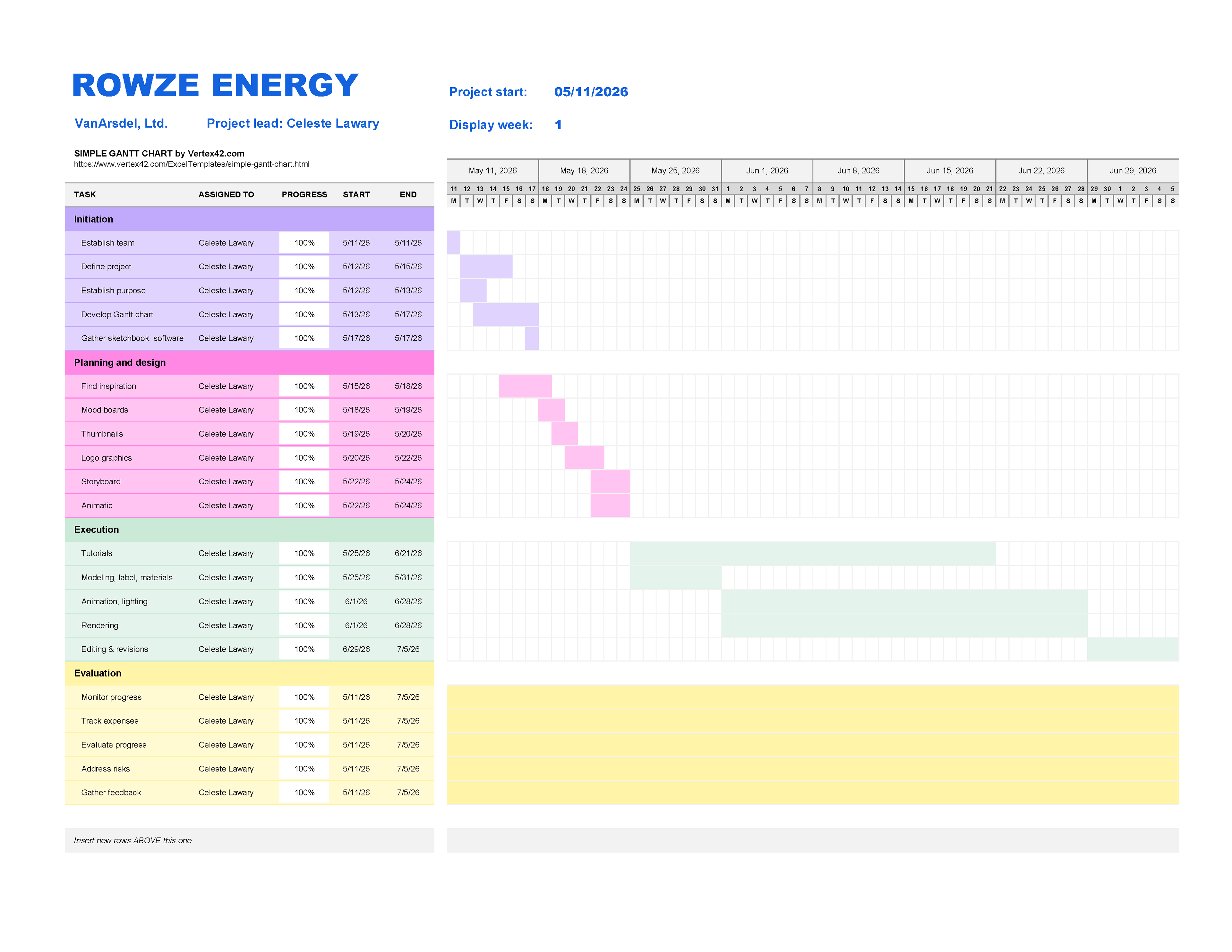
ROWZE ENERGY Gantt Chart
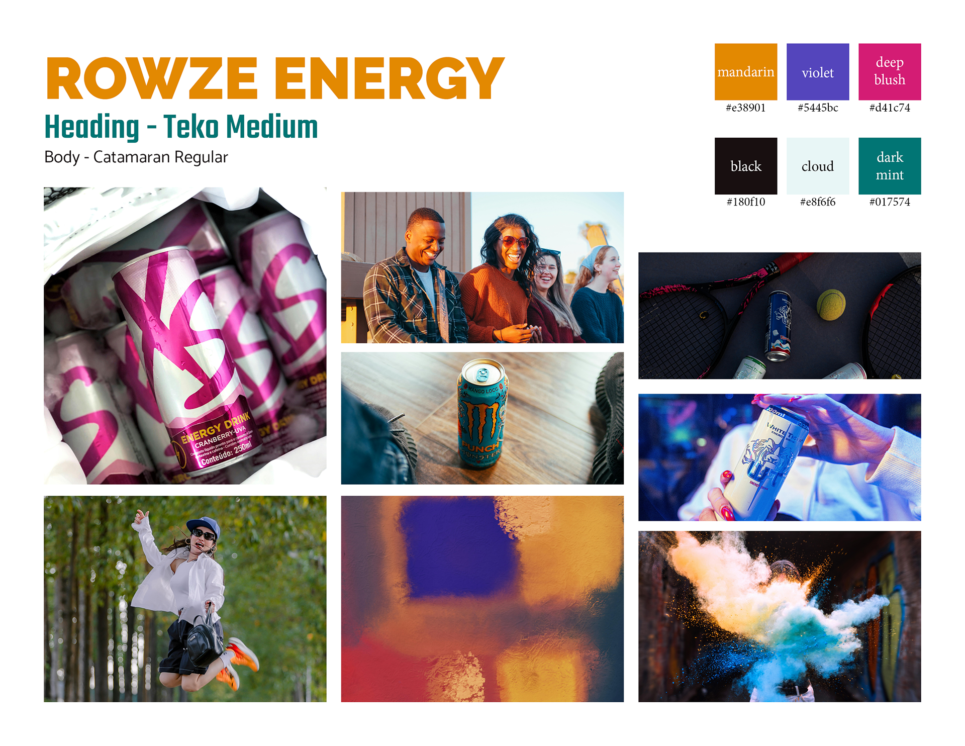
ROWZE ENERGY Mood Board 1
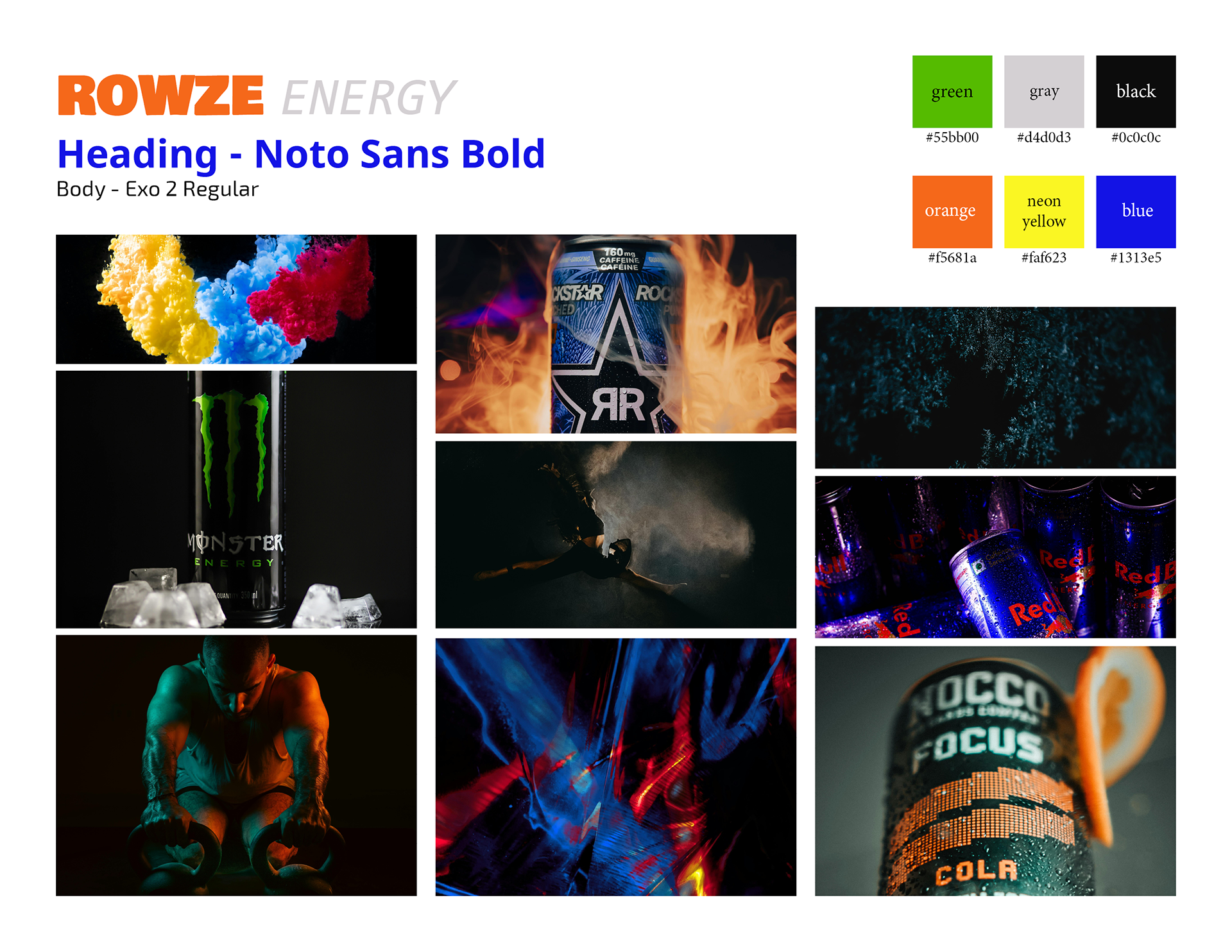
ROWZE ENERGY Mood Board 2
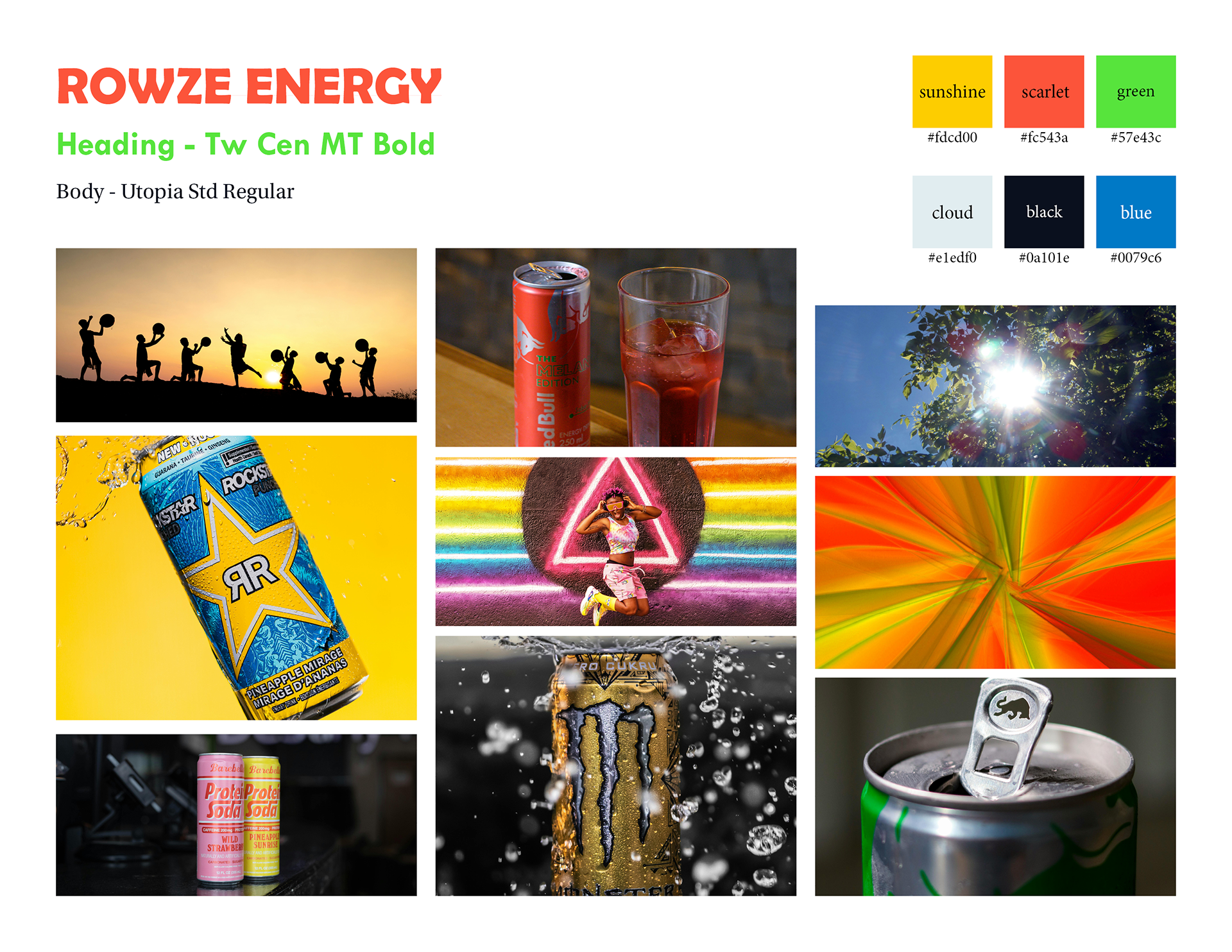
ROWZE ENERGY Mood Board 3
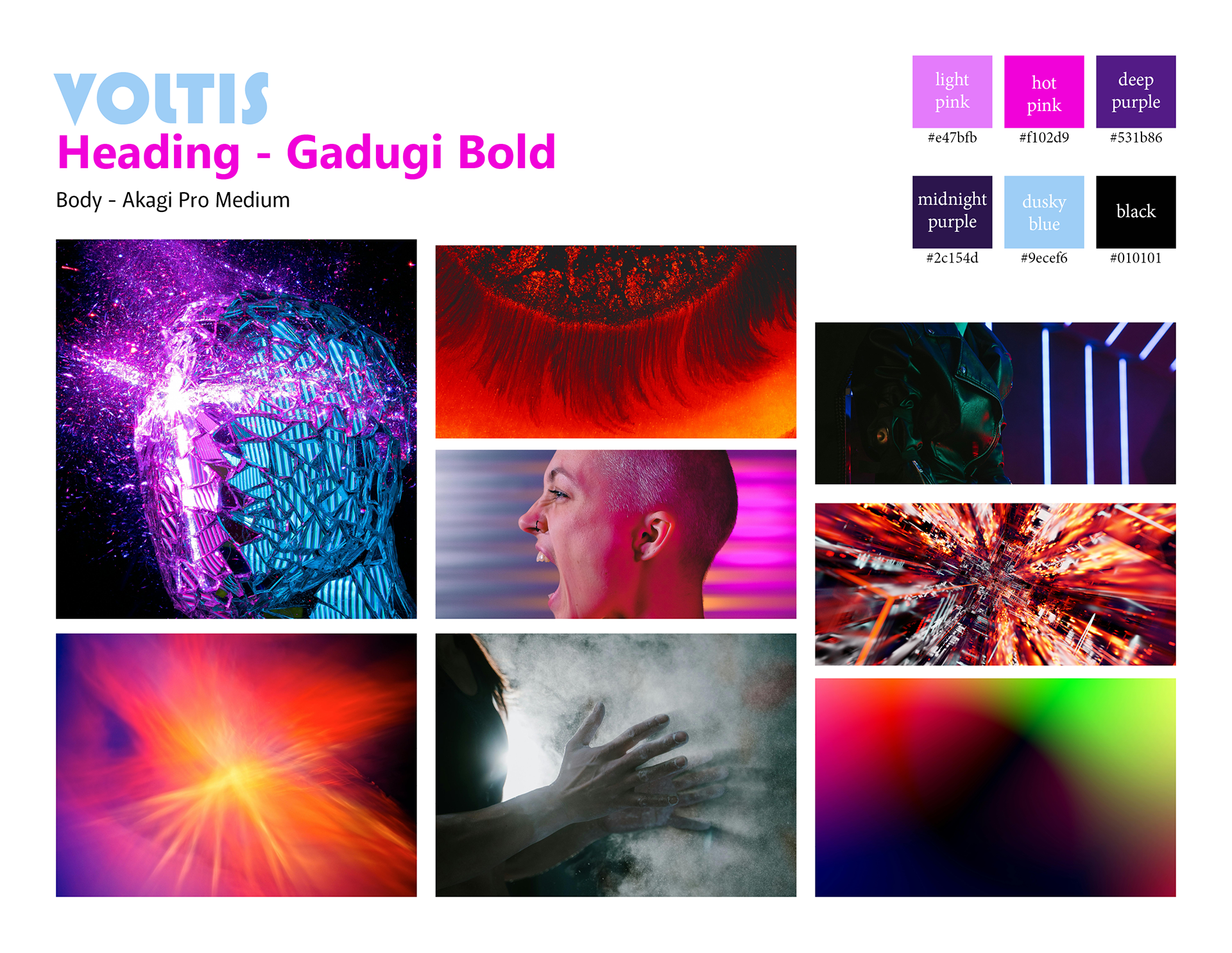
VOLTIS Mood Board 1
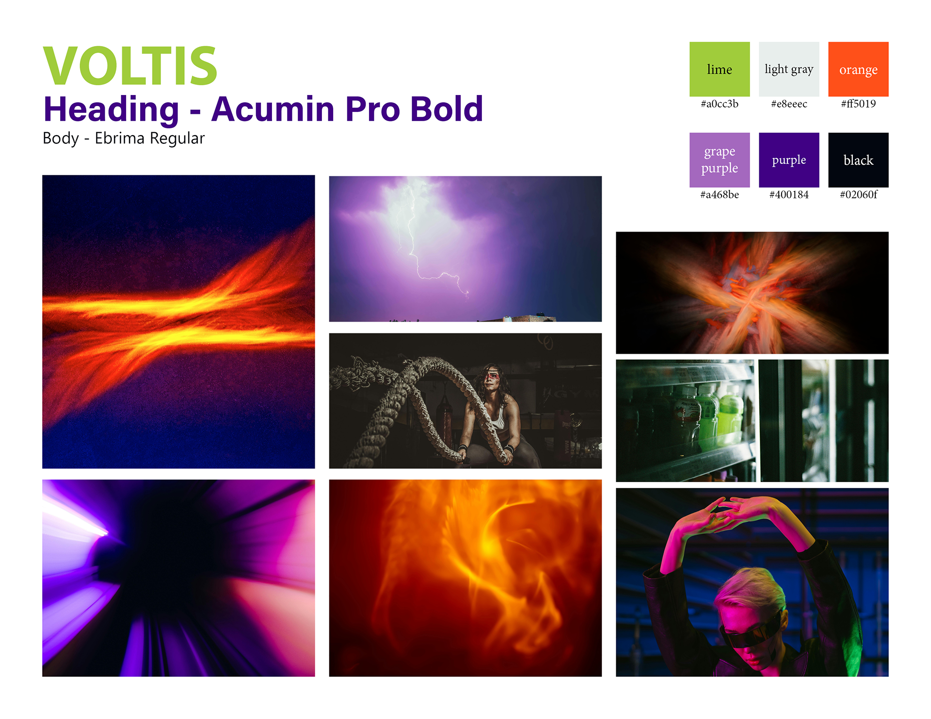
VOLTIS Mood Board 2
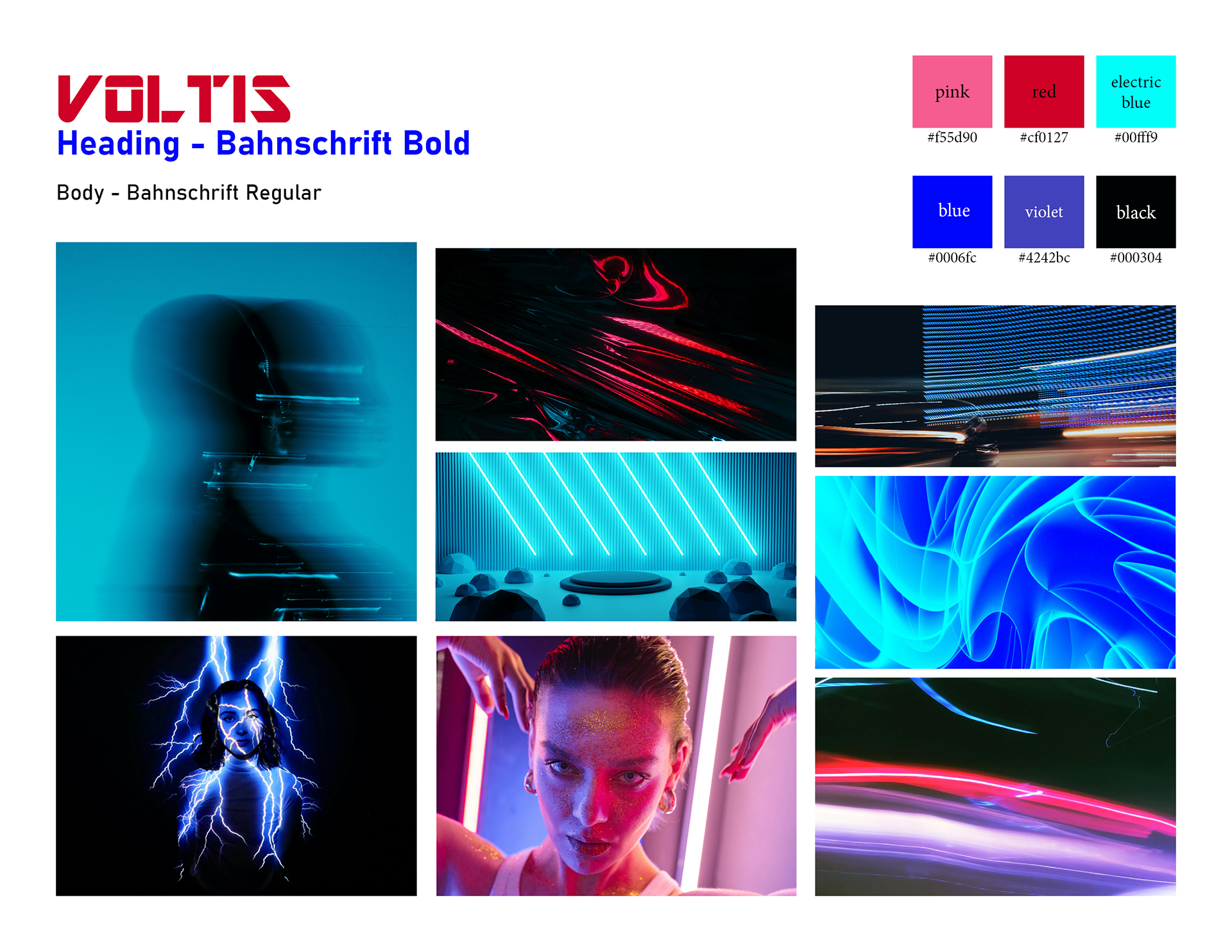
VOLTIS Mood Board 3
For the logos, I wanted them to convey high energy, so I reflected this in my thumbnail sketches. For ROWZE, I added thick bars behind the word “ROWZE” to give the impression of quick movement. I slanted them inwards to further lean into this idea. I reflected the “E” in the word to make it line up with the bars and make it look more interesting and modern. Also, the “E” in “ROWZE” and the first “E” in “ENERGY” are both yellow to bring the whole design together. The VOLTIS logo would include a lightning bolt and similar bars as well to imply lively movement. I liked the gradient its colors created, so I included it in the bars.
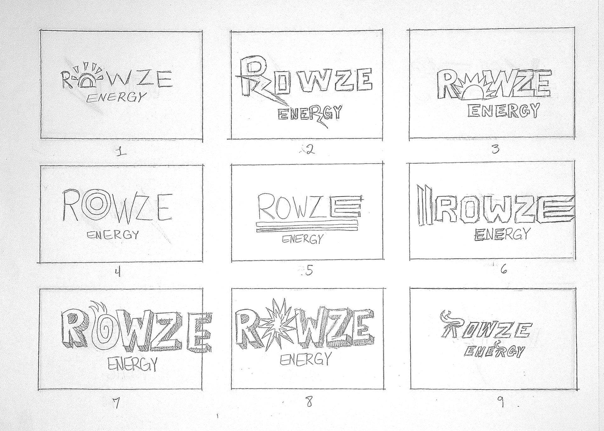
ROWZE ENERGY Logo Thumbnail Set 1
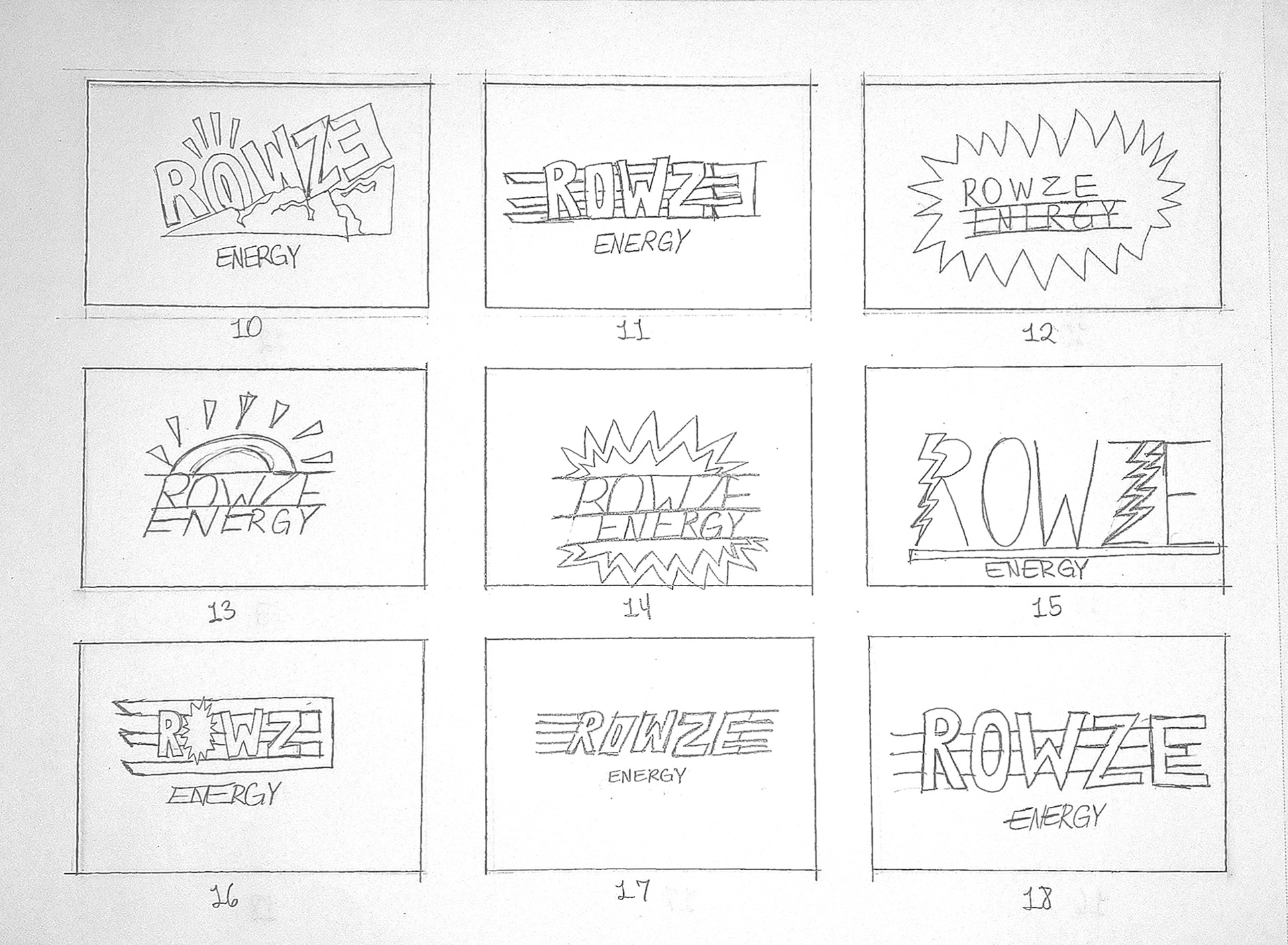
ROWZE ENERGY Logo Thumbnail Set 2
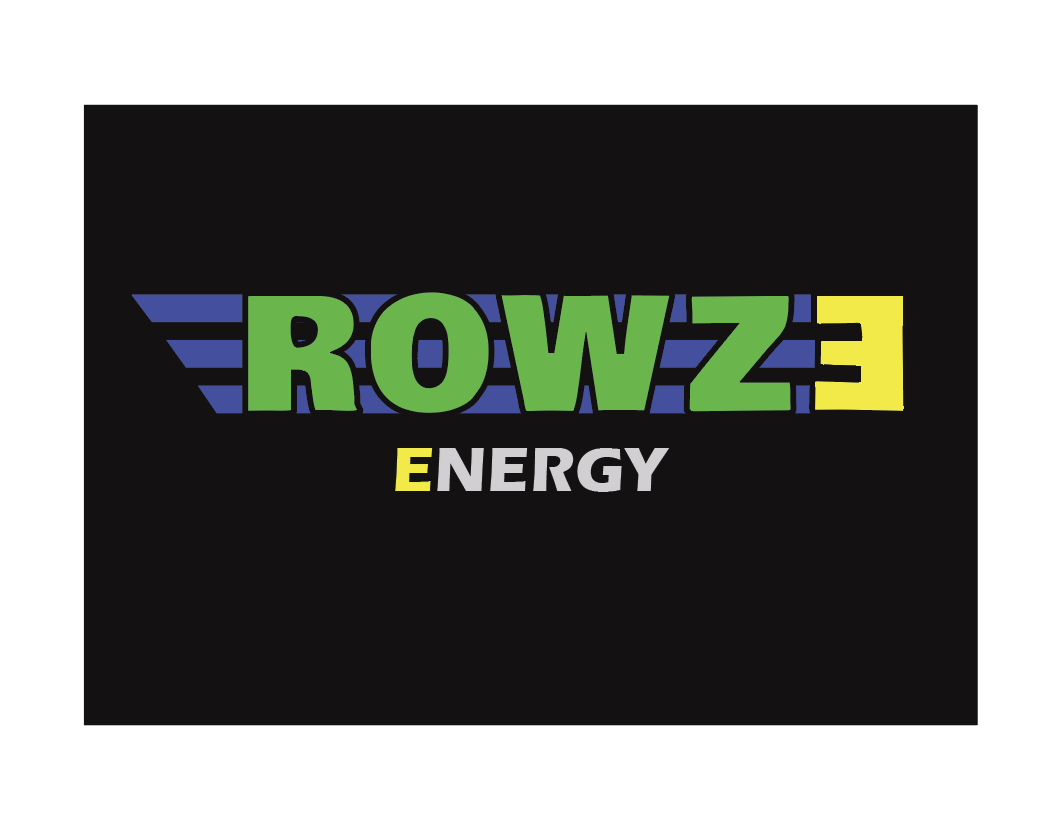
Final ROWZE ENERGY Logo Design
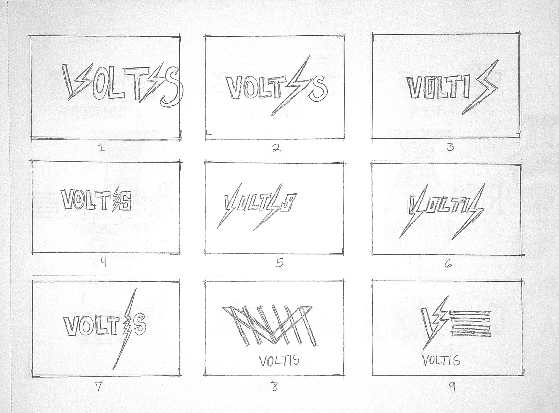
VOLTIS Logo Thumbnail Set 1
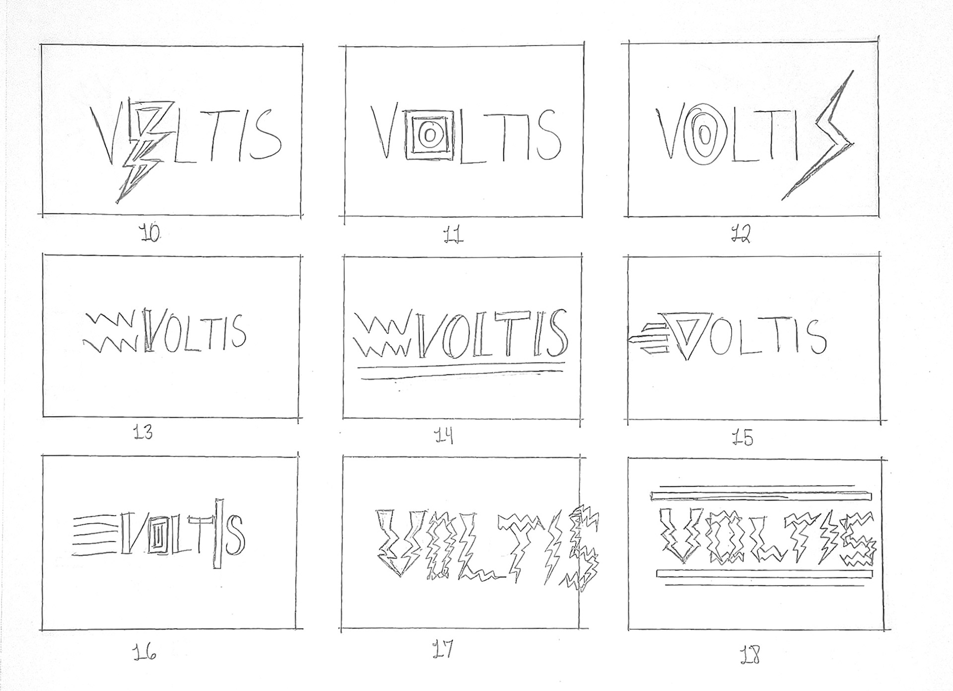
VOLTIS Logo Thumbnail Set 2
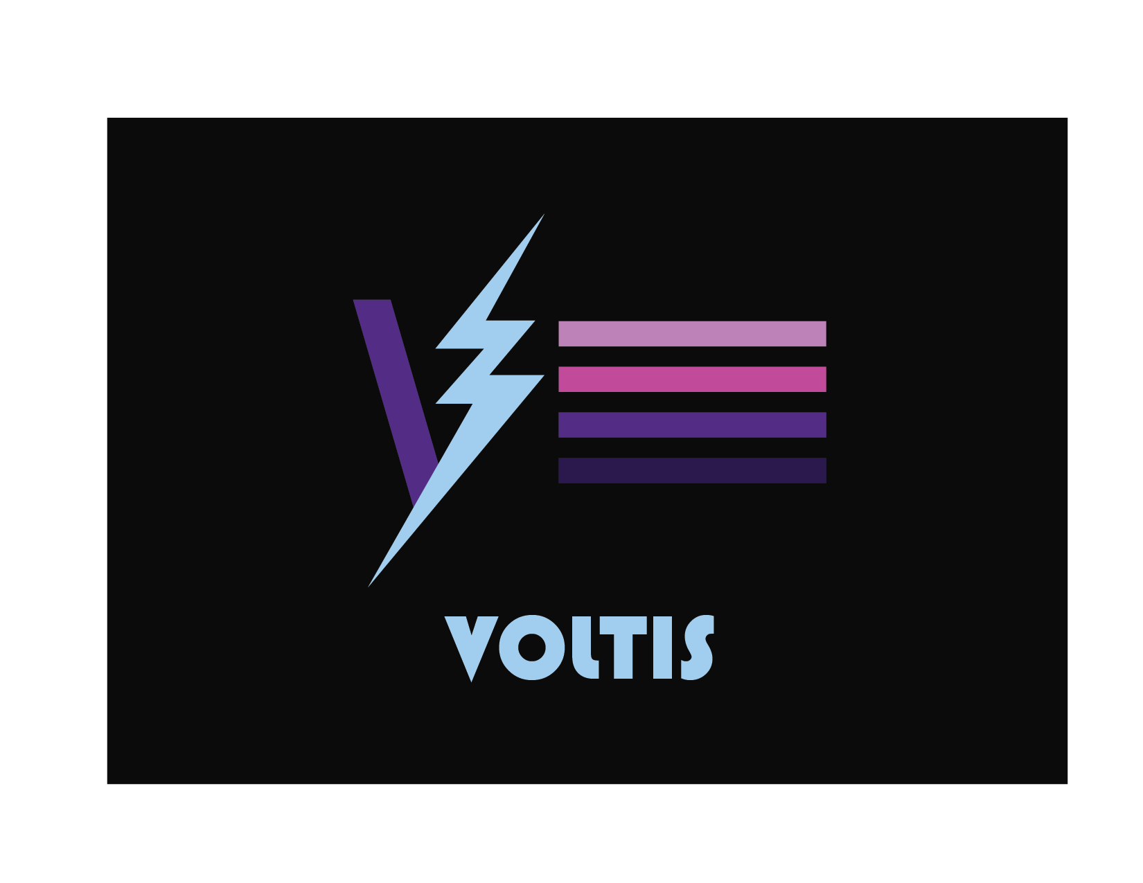
Final VOLTIS Logo Design
Storyboarding
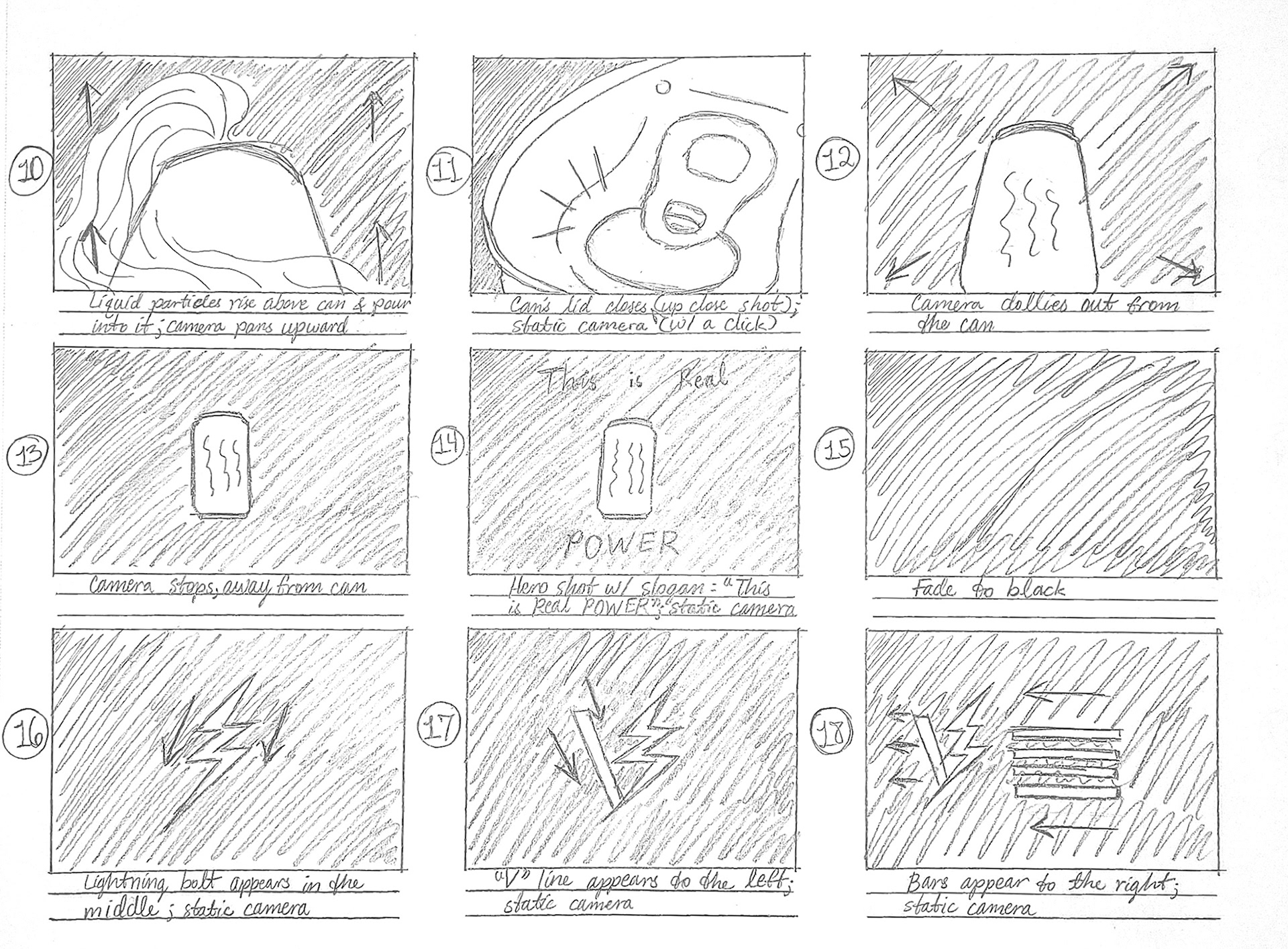
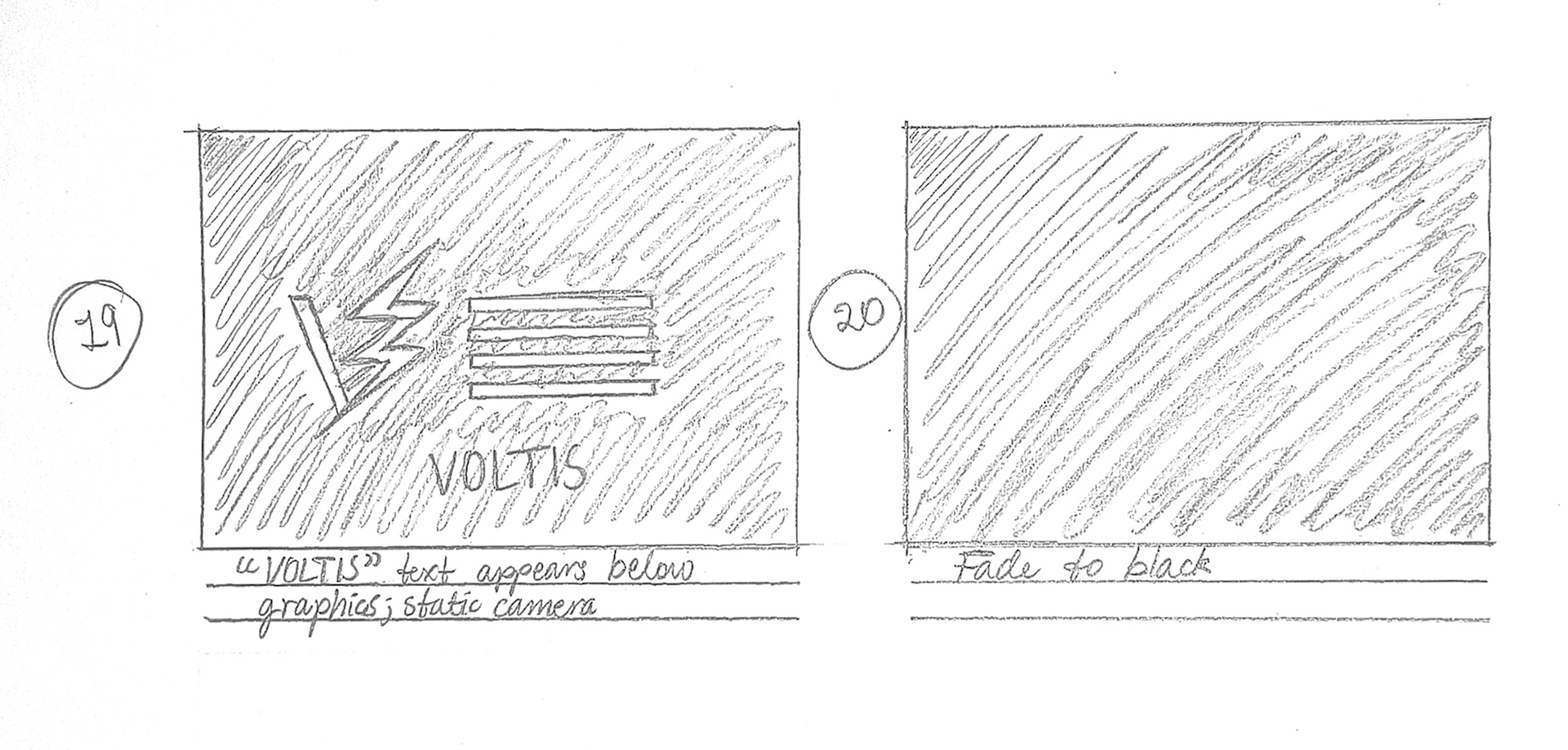
I imagined the can emerging from darkness and rotating in the negative space. I also knew I wanted liquid to explode/splash out from behind the can and pour into it. So, I created a storyboard centered on these ideas. My goal was to make each shot interesting and make the shots feel cohesive and the camera movements feel dynamic and engaging. In addition, I planned for the VOLTIS logo animation to play at the end, so I included it in the storyboard. Once that was done, I created an animatic from my storyboard, editing it in After Effects to test timing and cuts.
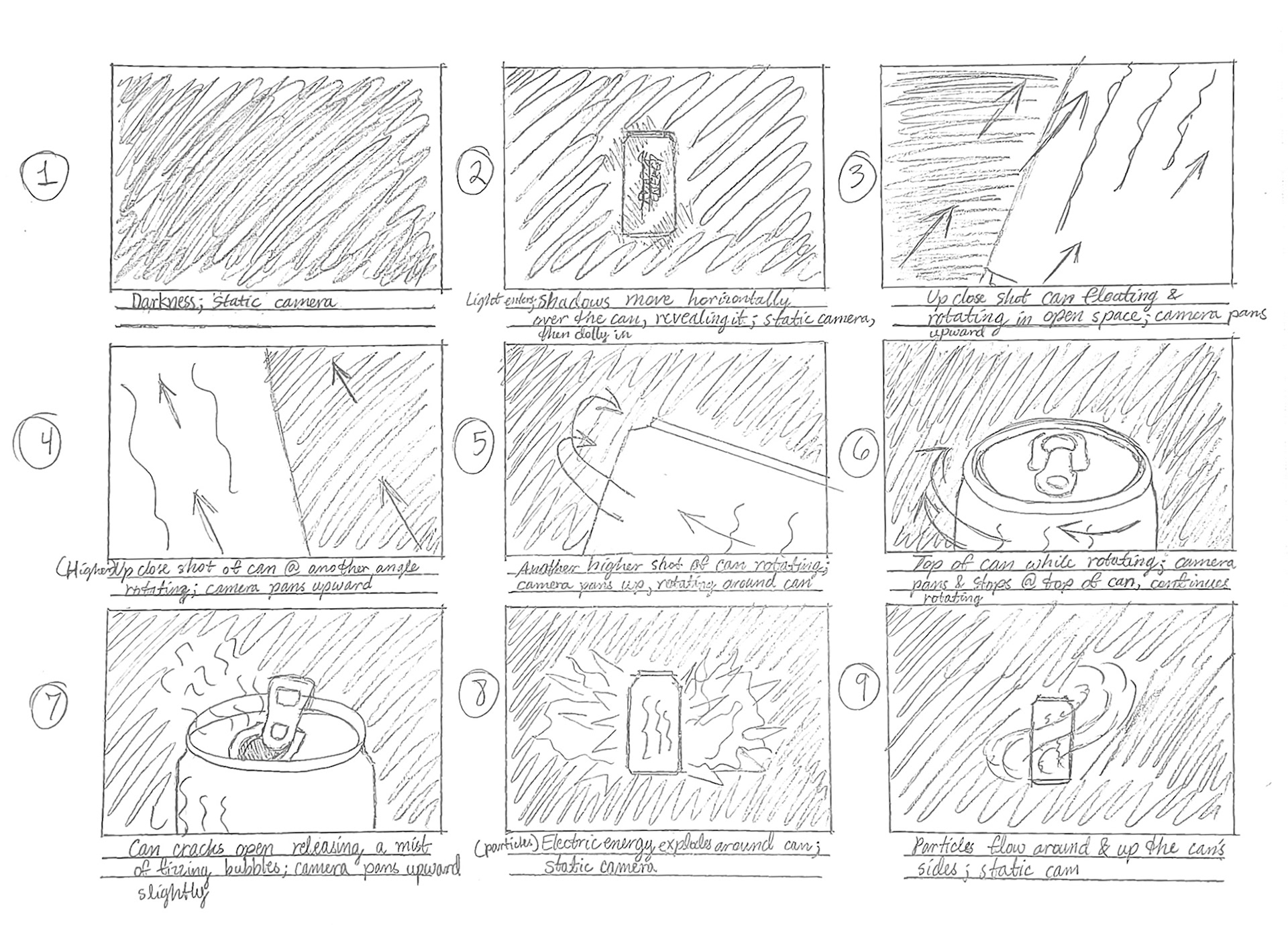
Storyboard Thumbnail Set 1
Storyboard Thumbnail Set 2
Storyboard Thumbnail Set 3
Animatic
Production
This portion of the project was completed in 6 weeks. Following a few tutorials, I modeled the energy drink can, which went relatively smoothly. At the same time, I created a label for the energy drink can, referencing images of real ones online and including a general nutrition facts image. Once that was finished, I applied the label to the can. Lastly, I set up the scene, including cameras and several lights: a key light, fill light, and three back lights. Each shot has its own Cinema 4D file to prevent my computer from crashing.
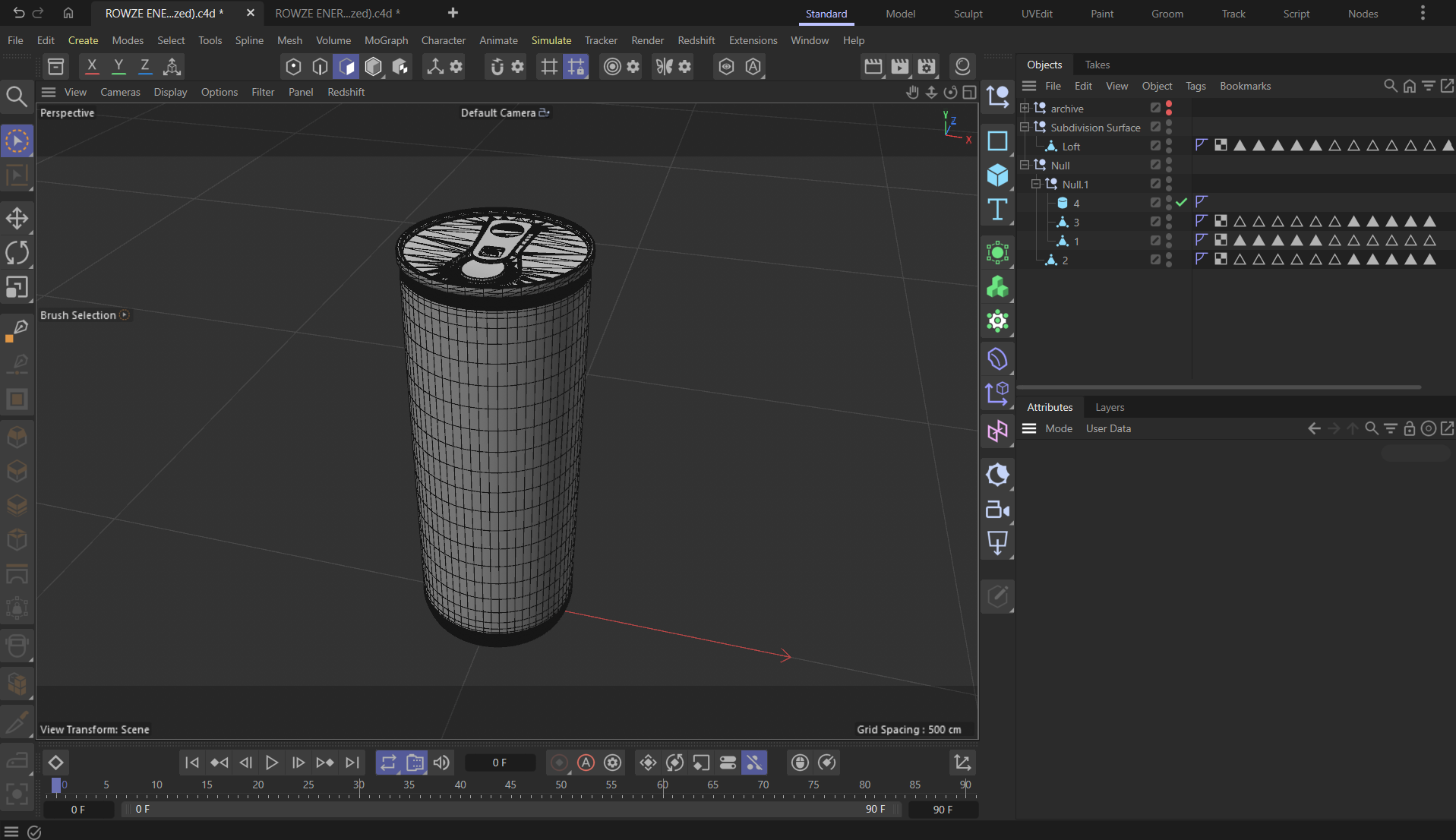
Can model (wireframe)
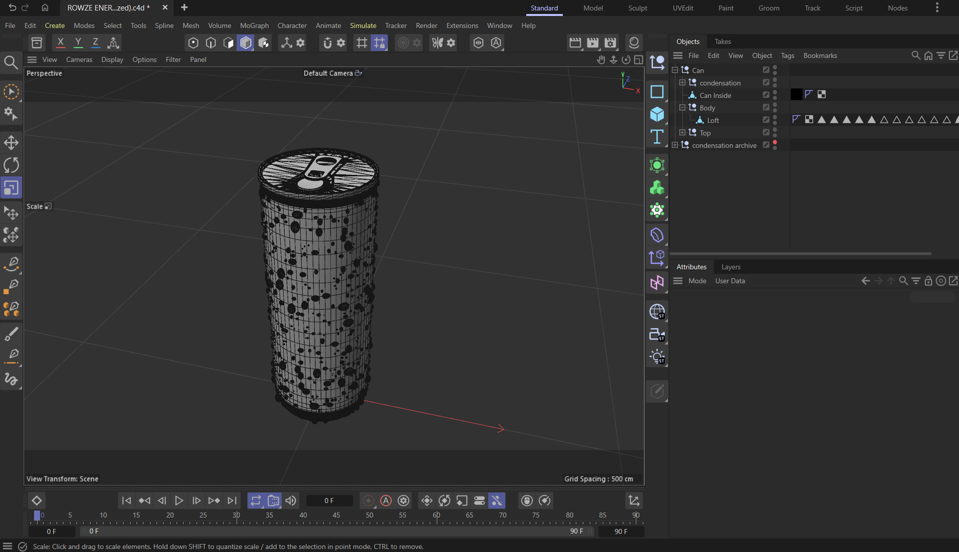
Can w/ condensation (wireframe)
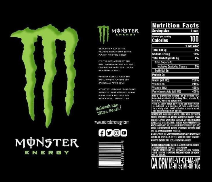
Reference Label Design
Recycle Icon Reference
Social Icons Reference
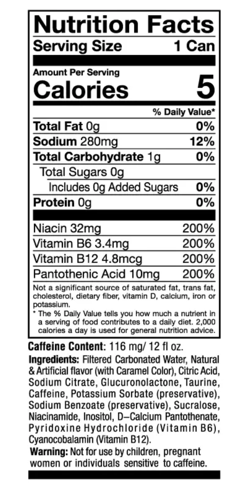
Nutrition Facts Image (Not mine)
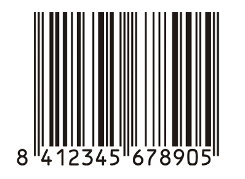
Bar Code Image (Not mine)
Final Social and Recycle Icons
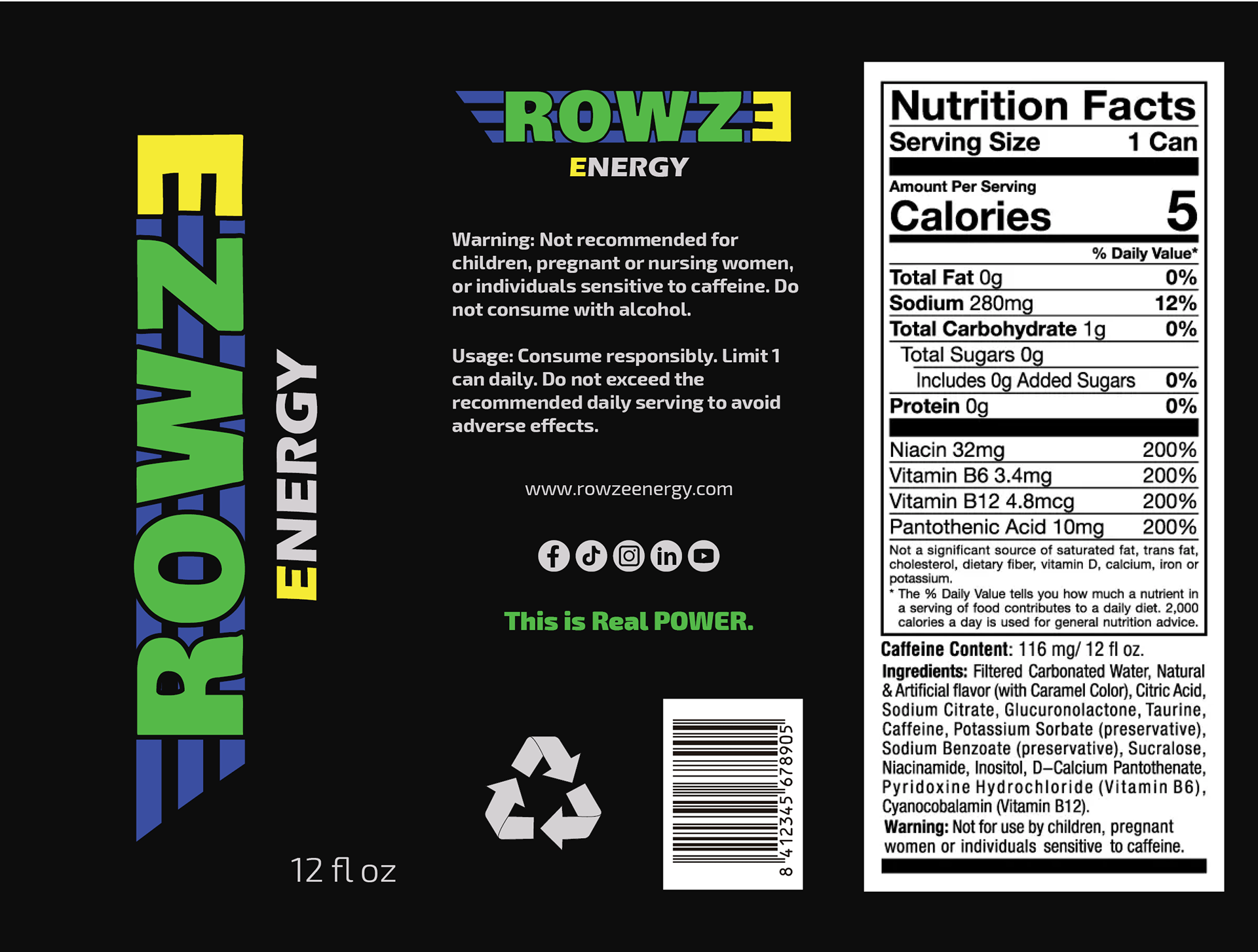
Final Label Design
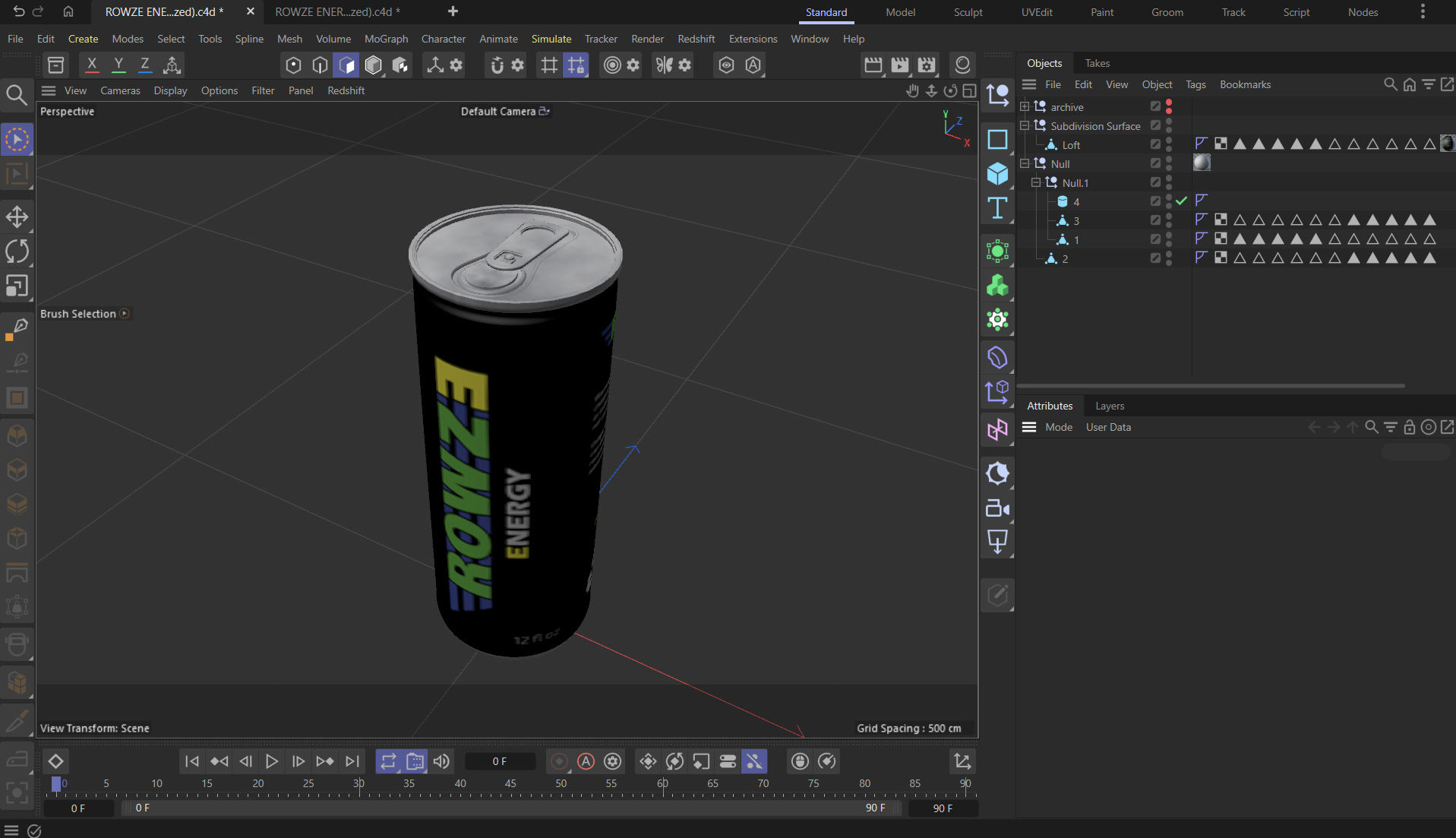
Can model w/ materials
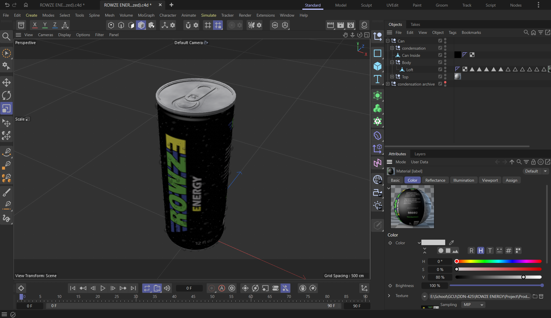
Can w/ condensation w/materials
Draft 1
Draft 2
Draft 3
I faced various challenges. Shot E, showing the spray mist, was particularly challenging to adjust because C4D kept crashing while rendering 500,000 particles in every frame, which is understandable. Baking them seemed to help at first, as I got a good 4 frames out of it. The rest, however, were at 300,000 to 400,000 particles, making the mist look inconsistent. Since I didn’t render over the old frames, I imported the old and new frames and added a fade between them to create a seamless spray-mist animation. Additionally, in the splash shot, I noticed the opener wasn’t up, and I wanted water droplets to appear. So, I re-rendered the shot twice: once with the dry can and again with the condensation can, and I added a fade between the two in post. Moreover, I learned how important it is to know when to move on instead of dwelling on issues I can’t fix. For instance, I needed to create a transition between 2 shots. The energy drink can was in the same position, but the liquid simulations were different; therefore, I didn’t see a way to do it without it looking strange. As a result, I deviated from my original plan, making the second shot different from the first and adding a cut between them.
Post-Production
This portion coincided with production, as some scenes needed to be redone. After rendering each shot with Redshift, I imported the PNG sequences into After Effects and began editing. I cut out the parts where the can clearly stopped rotating to enhance the momentum and created a seamless transition for the spray. Other than that, there wasn’t much editing to be done for the ad. After that, I added music and sound effects from Pixabay. I used my knowledge of video editing and cinematography to guide my decision-making on what transitions and cuts to use as well as what kind of music to use. I also used my knowledge of sound design to help me decide how to edit the sound effects together. I rearranged and repeated the effects, speeding some up and slowing others down so they all wouldn’t sound the same. Lastly, I added music. Since the project is about power and dynamic energy, I thought rock music would fit well. I was lucky to find the perfect one on Pixabay as well.
Final Motion Video