Introduction
This project features a 10-second animation of my typographic design for a fictitious shoelace brand called Starbright Shoelaces. The Starbright Shoelaces brand board below was provided to me. The goal was to create a typographic design for a designated word, and I chose “LACE.” Then, my task was to design an animation for this word I designed and vectorized in Adobe Illustrator. This project demonstrates my skills in typographic design and 2D motion graphics.
Planning
Since I chose to work with the word “LACE” for this project, I decided to design the letters based on the look of shoelaces while also maintaining the brand’s modern style and identity. I tried to incorporate shoelace roping and aglets into most of my designs, focusing on combining shoelace characteristics with typography to spell the word. I sketched thumbnail concepts for the word on paper. One of the designs featured two shoelaces for two shoes, which sounded great conceptually. I also liked the simplicity of the design. Based on that sketch, I developed four separate sketches, each containing a letter. Based on sketch #30, I developed four separate sketches, each containing a letter. After that, I vectorized each letter in Adobe Illustrator and put them all together to spell out the word "LACE," connecting the L and A and the C and E.

Starbright Shoelaces Brand Guide
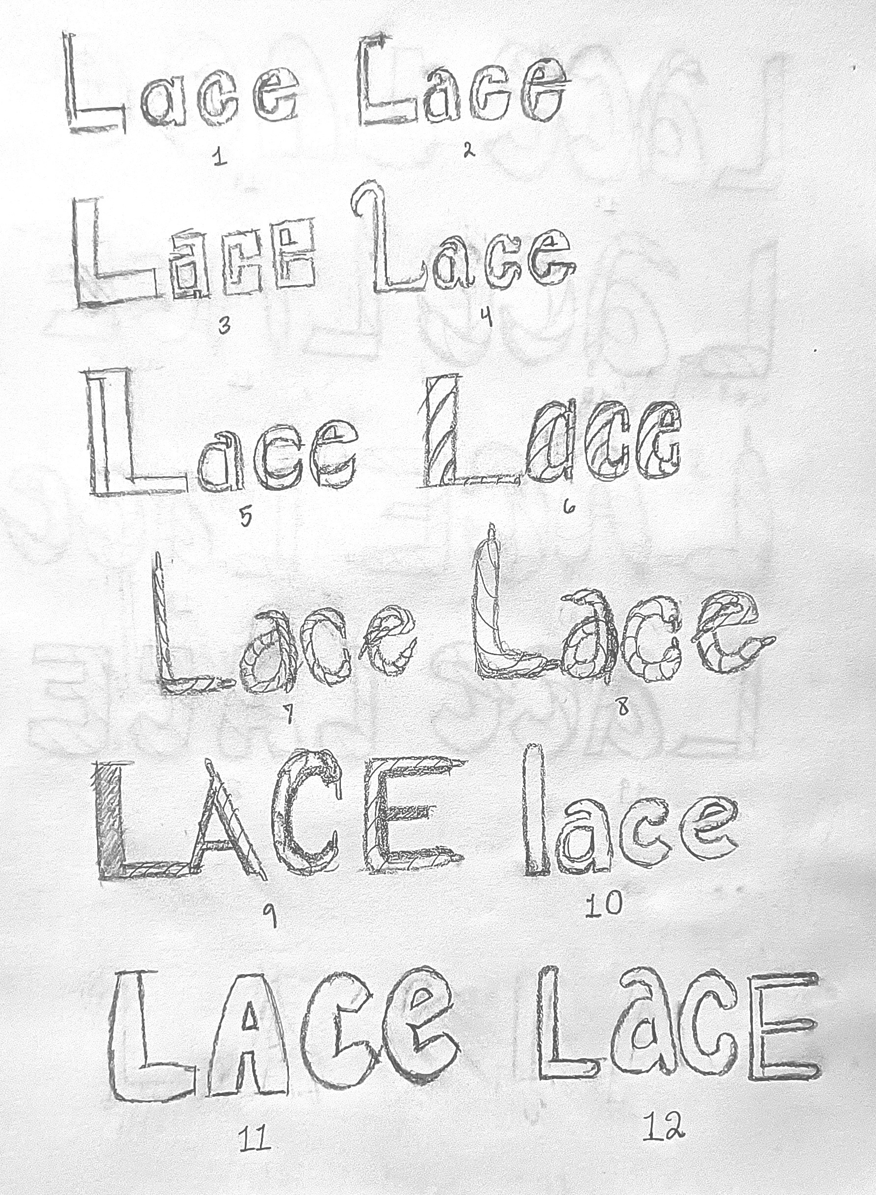
Thumbnail Sketch Set 1
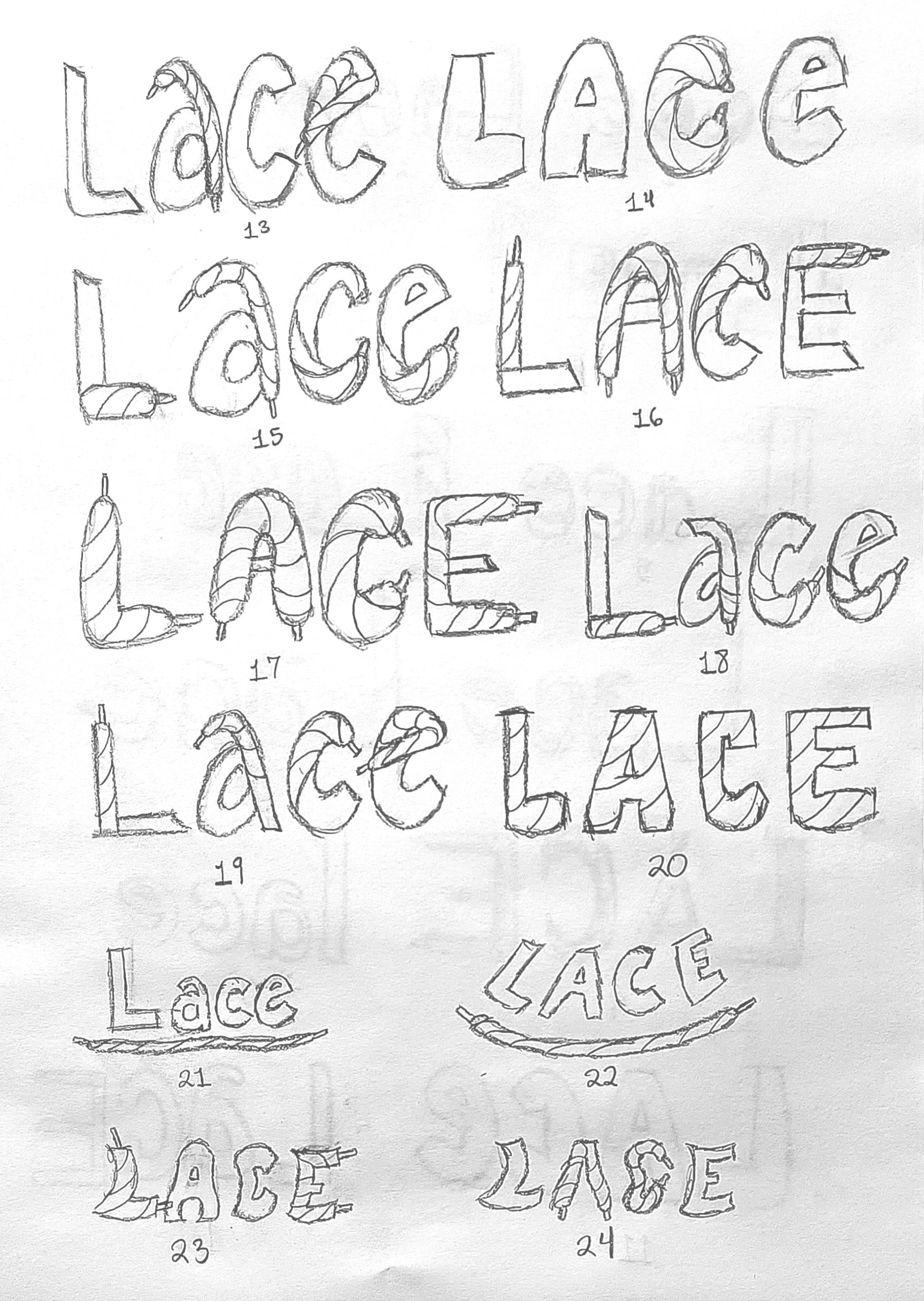
Thumbnail Sketch Set 2
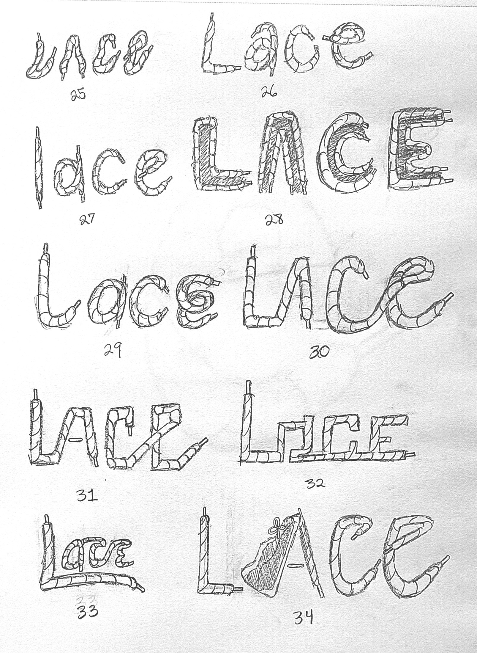
Thumbnail Sketch Set 3
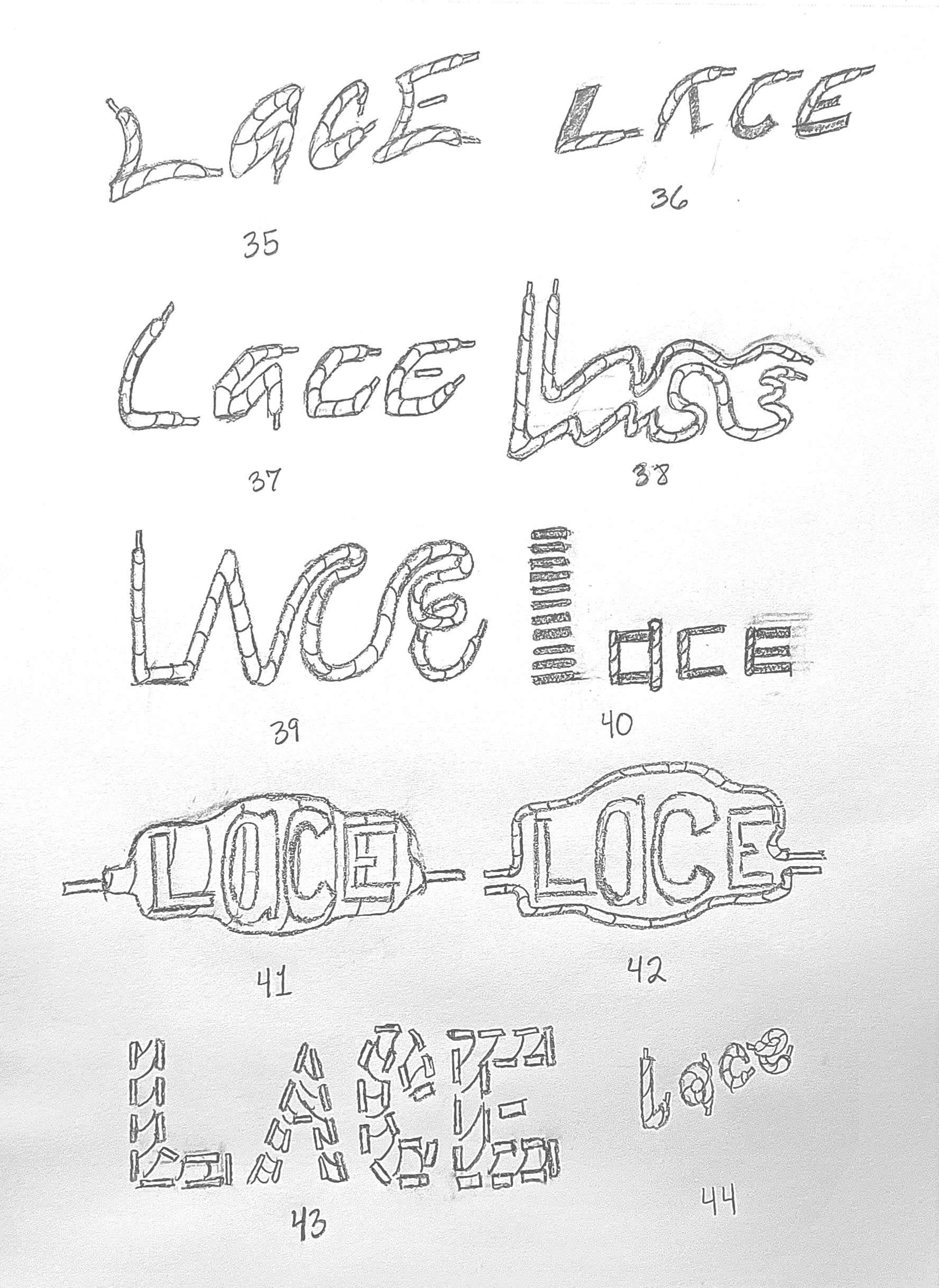
Thumbnail Sketch Set 4
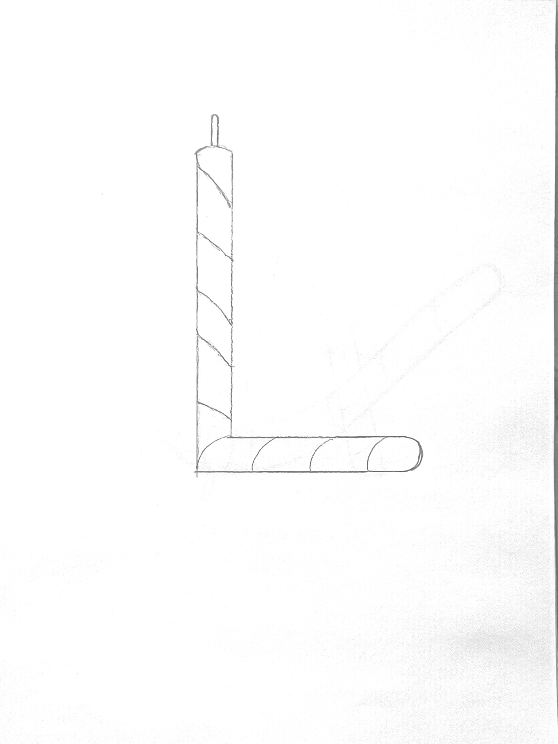
“L” Sketch
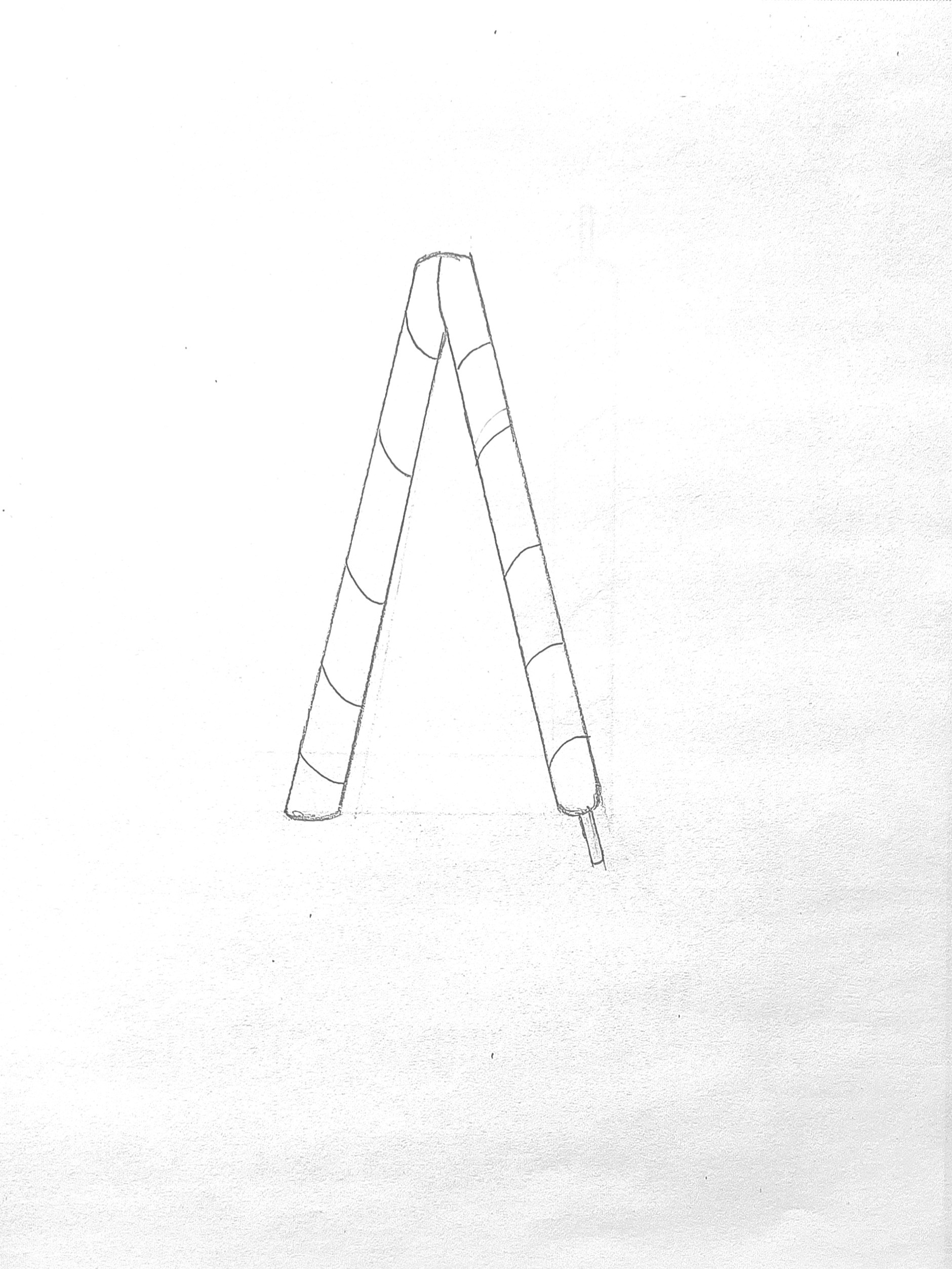
“A” Sketch
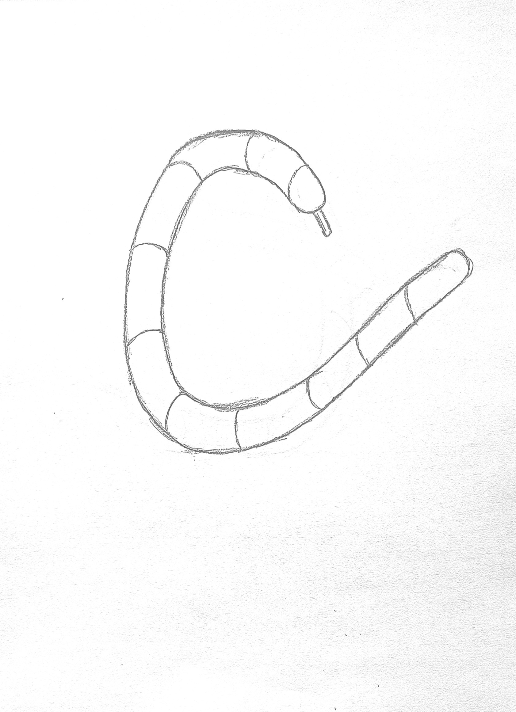
“C” Sketch
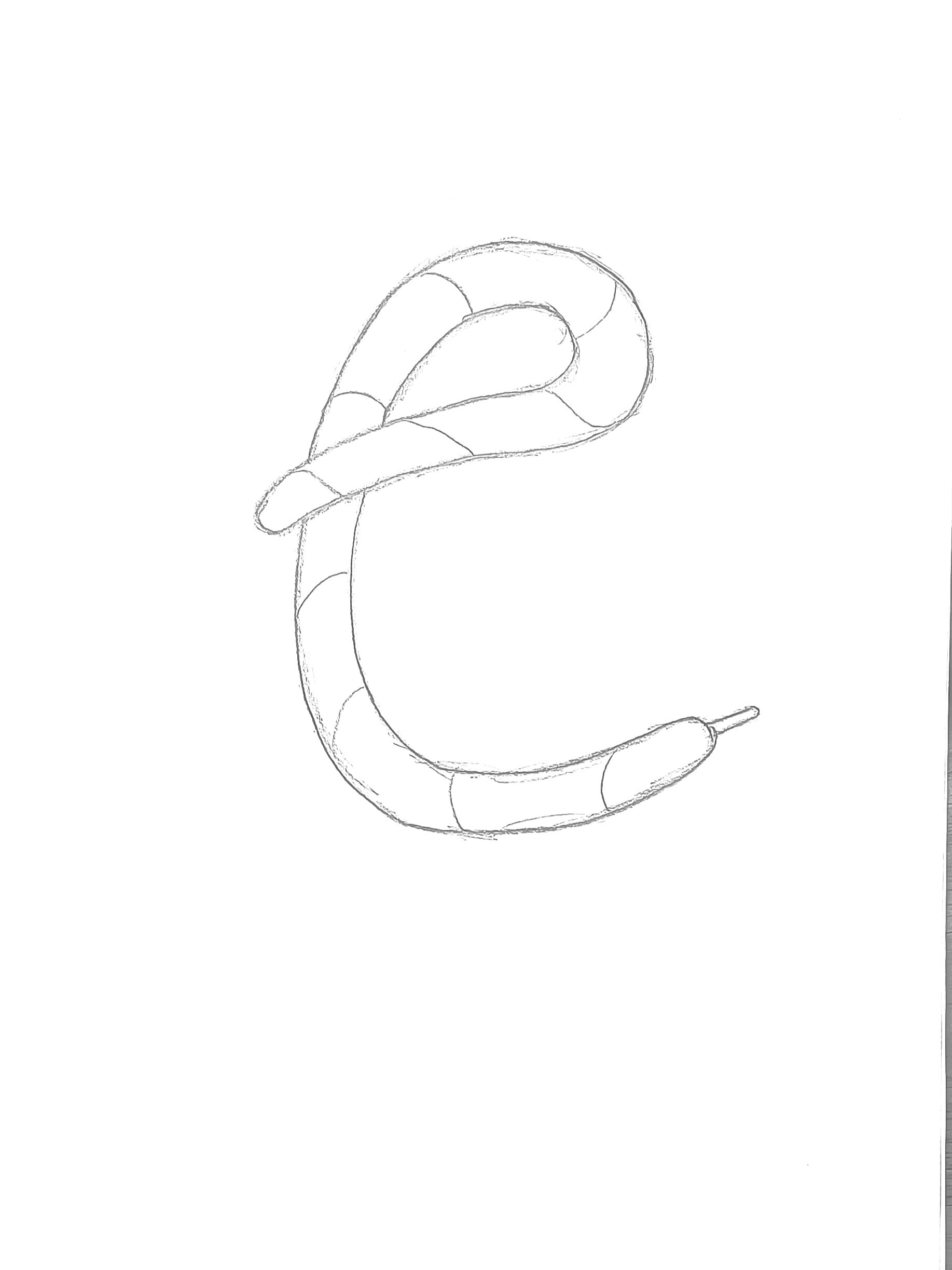
“E” Sketch
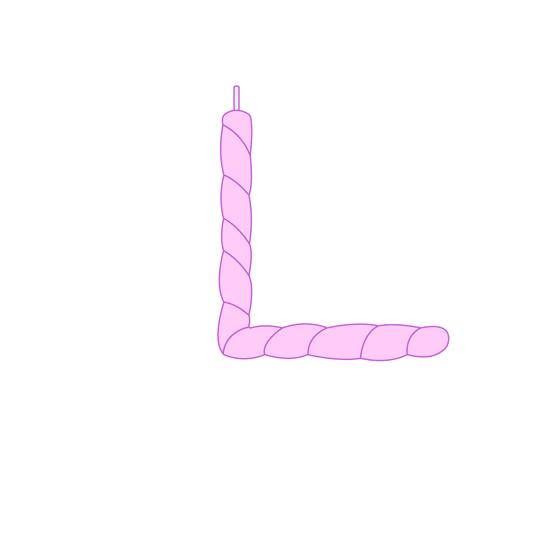
“L” Vector
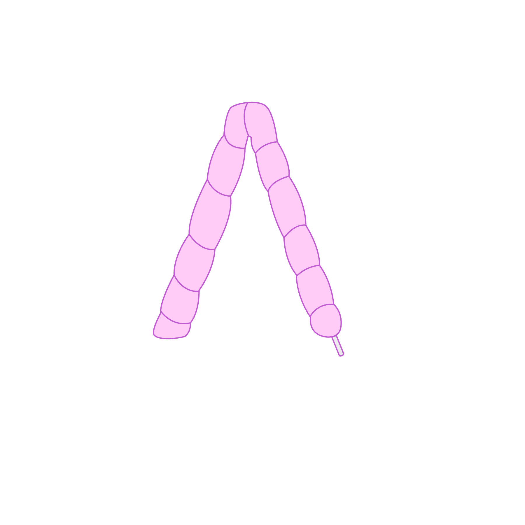
“A” Vector
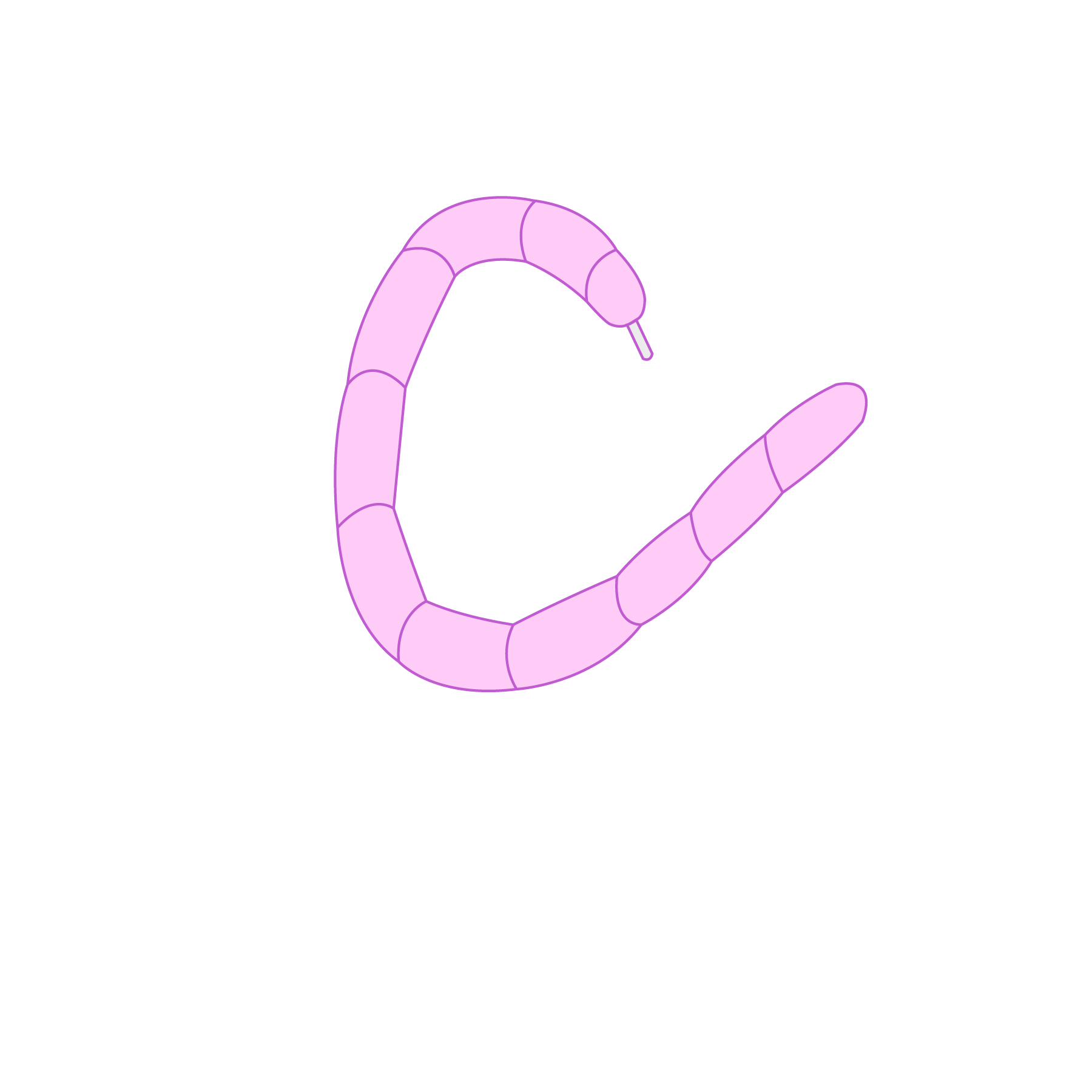
“C” Vector
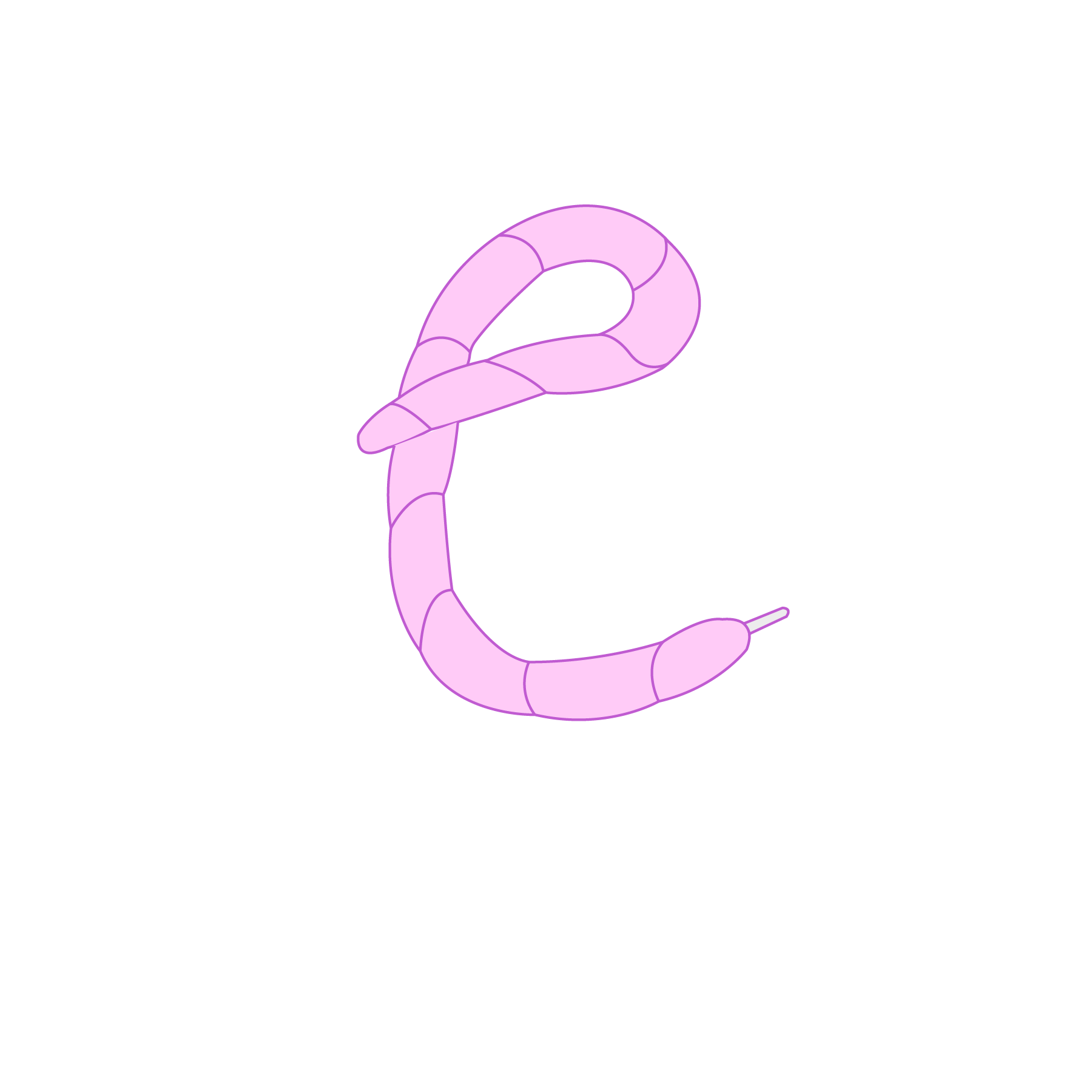
“E” Vector

Vector LACE Typographic Design
Storyboarding
When that was done, I moved on to creating 3 storyboards. I envisioned the two shoelaces moving into view by twisting and looping, spelling “LACE” in the end. I thought it would be fitting to make the word move into frame in a fluid, wavy motion because it feels natural to the shoelace and makes it more interesting to look at. I chose to animate
Storyboard #1.
Storyboard #1.

Storyboard 1

Storyboard 2
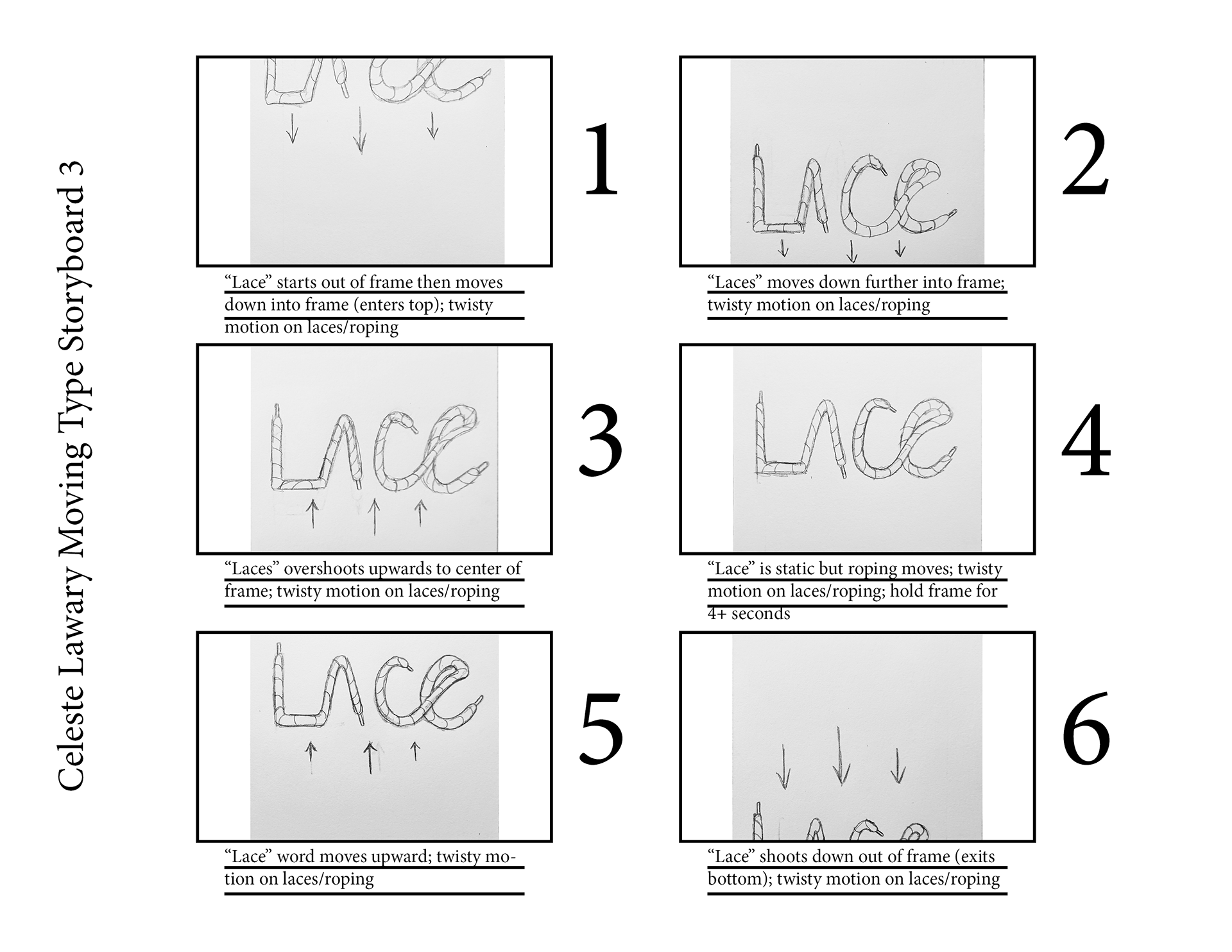
Storyboard 3
Production
This stage took 1 week to complete. Referencing the first storyboard and using Adobe After Effects, I created two shoelace objects, rigged them using the Puppet Tool, and animated them along their own paths. I made the shoelaces with the same colors: pink, purple, and light gray. I did this for both the “LA” shoelace and the “CE” shoelace. The “LA” shoelace enters from the left, and the “CE” shoelace enters from the right. The only challenge during this stage was using the Puppet Tool and paths to achieve the look I wanted. However, I overcame it quickly.
Post-Production
I decided to add more graphics and color to make the project look more interesting. I added four of the brand’s star graphics, two large and two small, and animated them twinkling/blinking by animating their scale. Then, I added four bands in the background, two black and two orange, and animated them coming into frame with the Wipe effect. I finalized the project by adding a wiggly effect to the type by adjusting the letters’ positions to increase the sense of charm and positivity. The stripe and star graphics match the brand’s aesthetic, style, and colors, making the project look more on-brand
and cohesive.
and cohesive.
Final Moving Type Design