The Starbright Sholaces brand board below was provided to me. My task was to design pages for two minor editorials for an eMagazine for this brand. I chose to make each editorial two pages long.
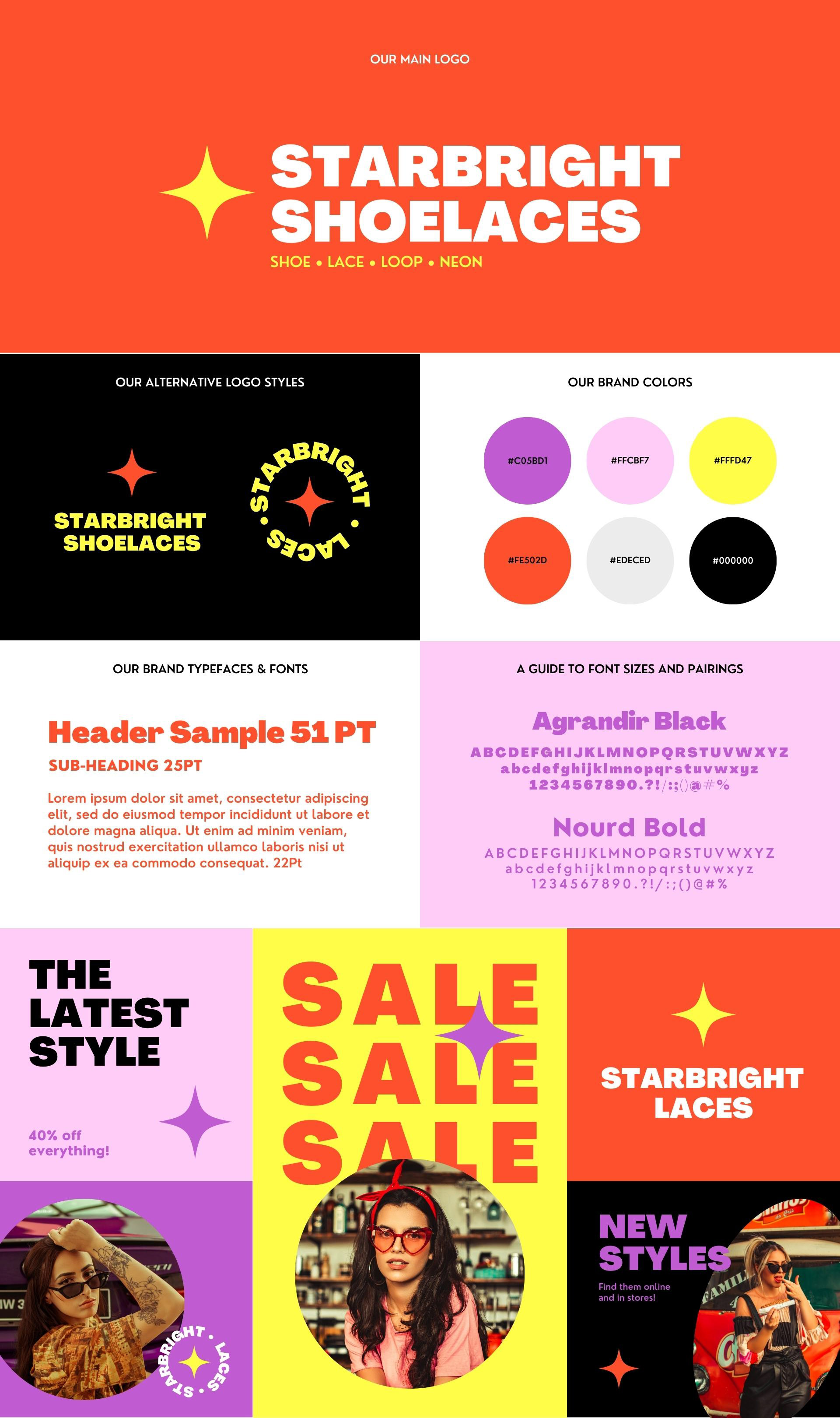
My focus for this project was to design page layouts to match the brand’s contemporary, trendy, and positive feel. I started by researching modern eMagazine page layouts and finding inspiration.
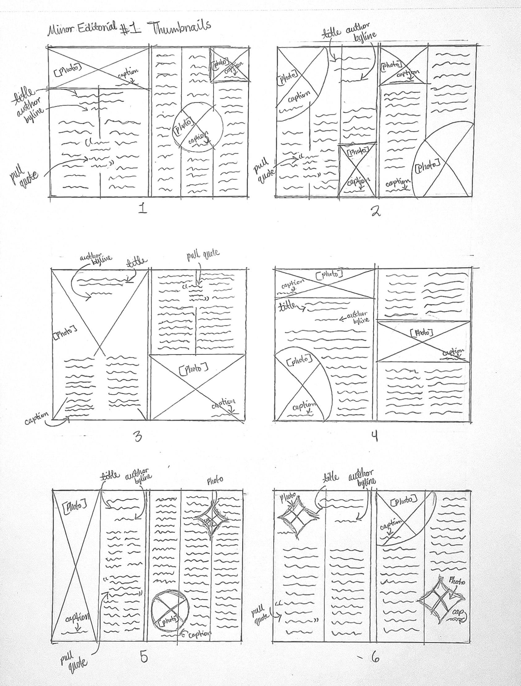
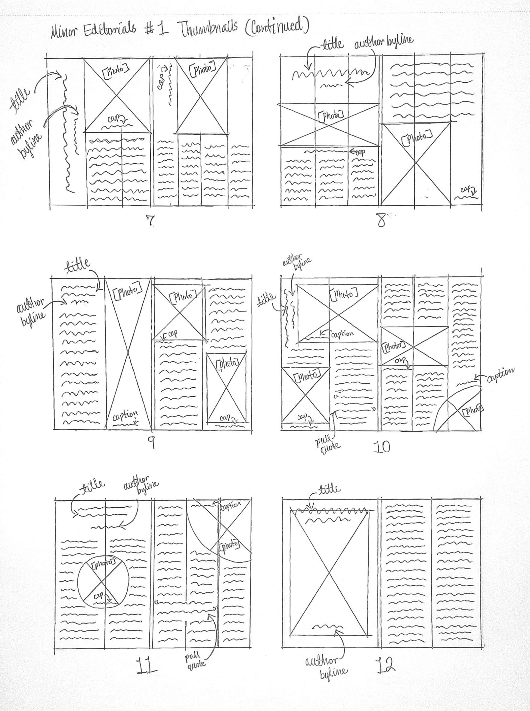
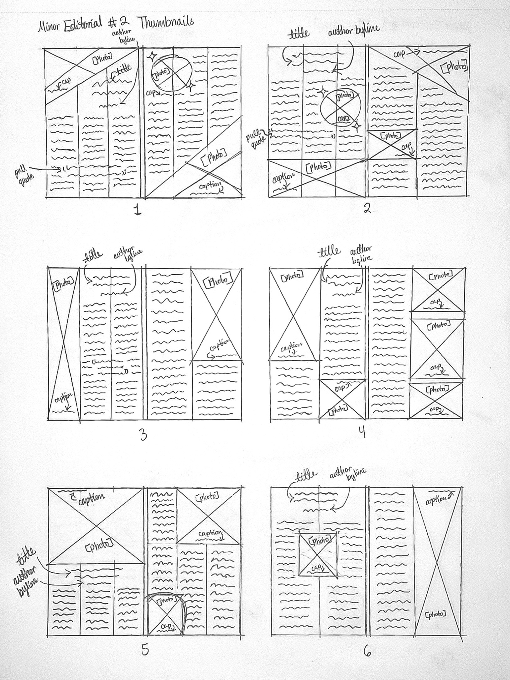

After choosing sketch #10 for Minor Editorial 1 and sketch #6 for Minor Editorial 2, I developed roughs for each of them.
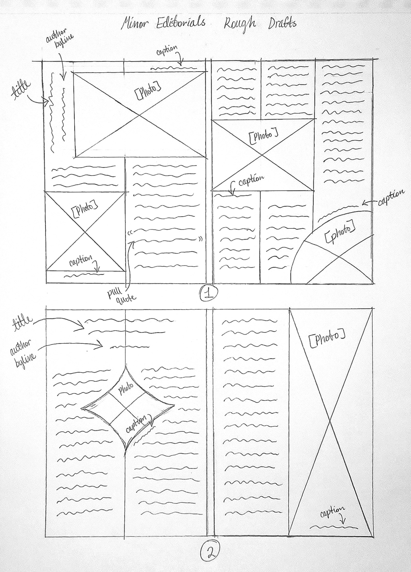
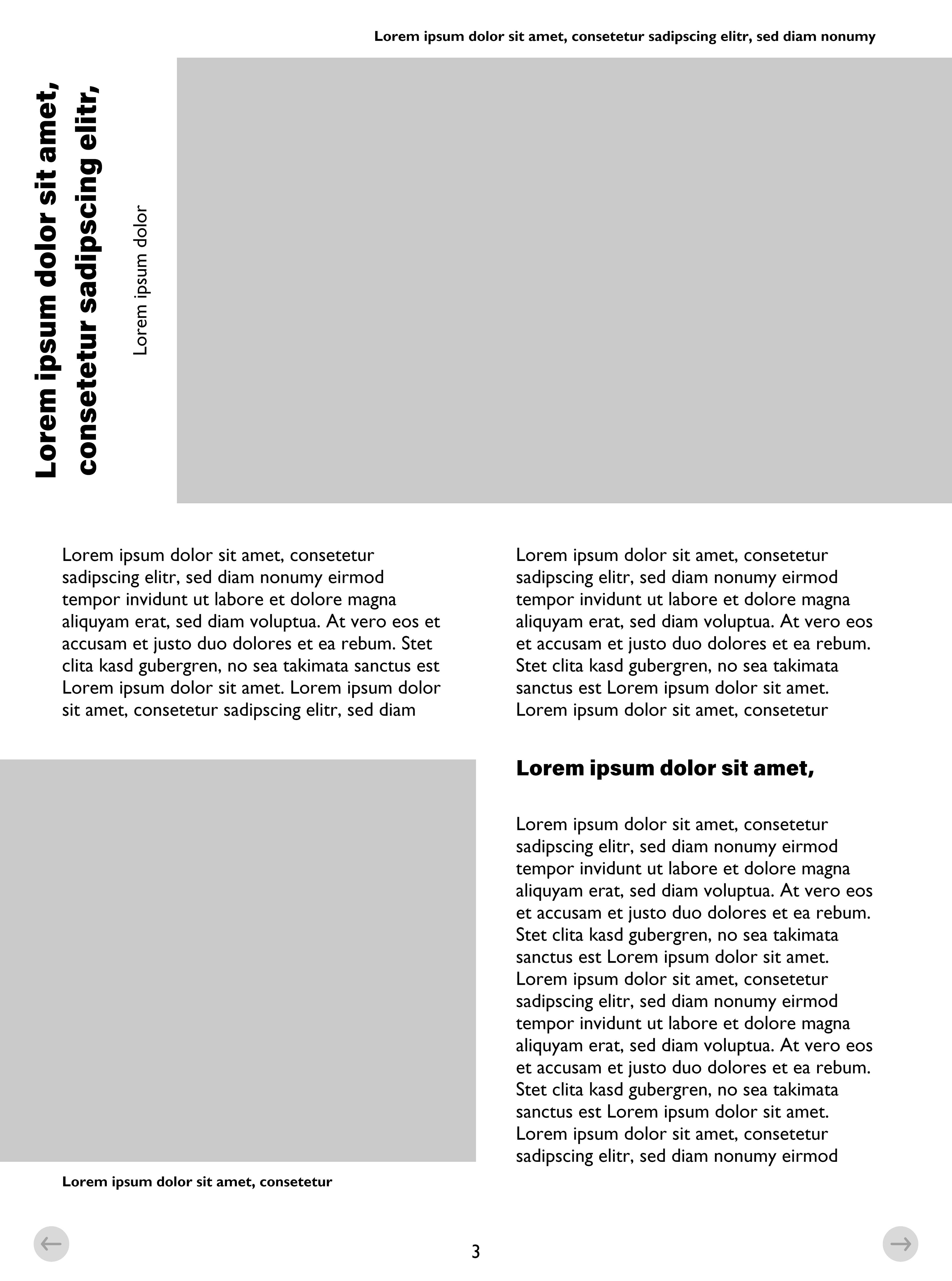
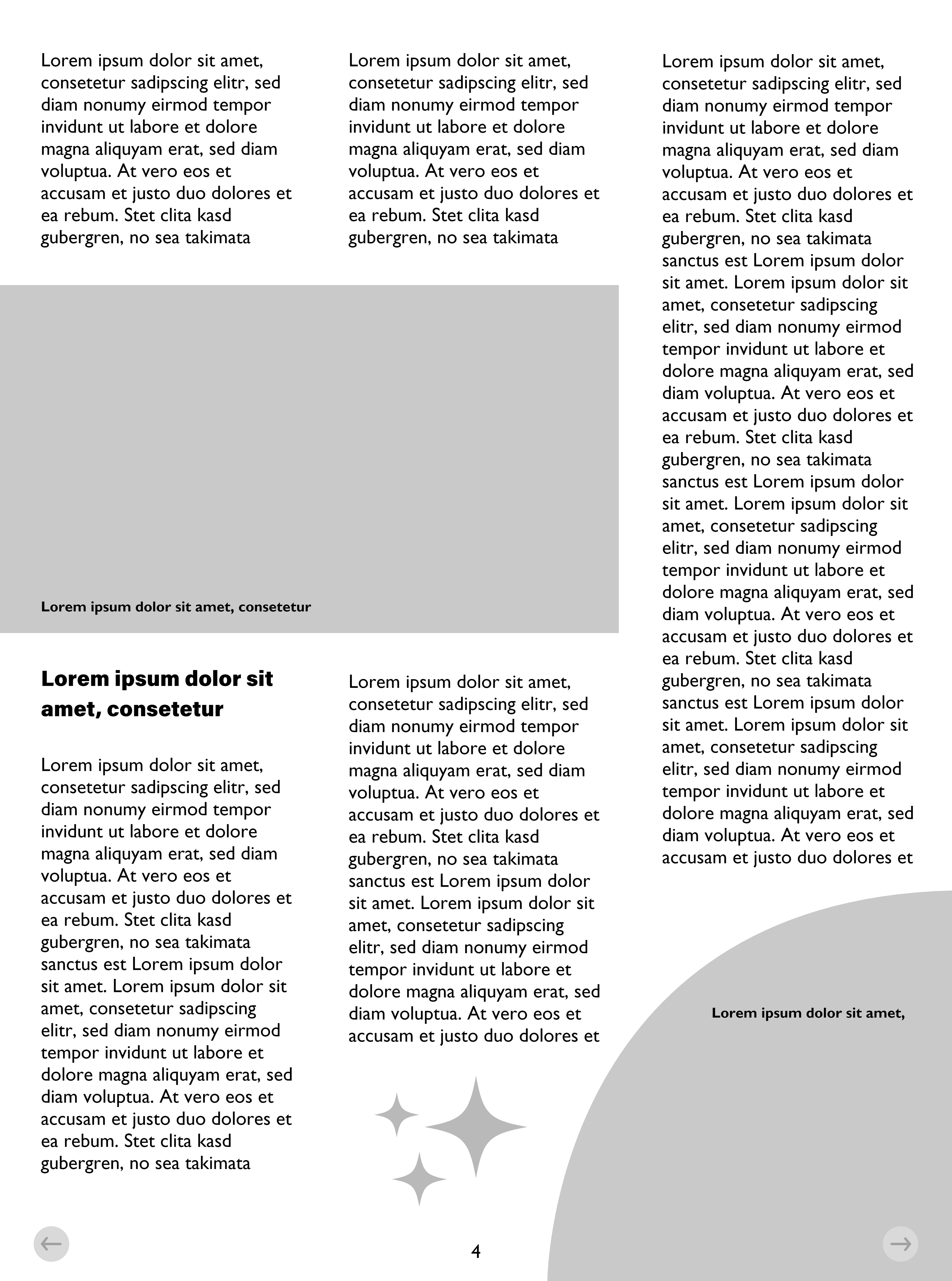
Once that was done, I developed the wireframes for the four pages.


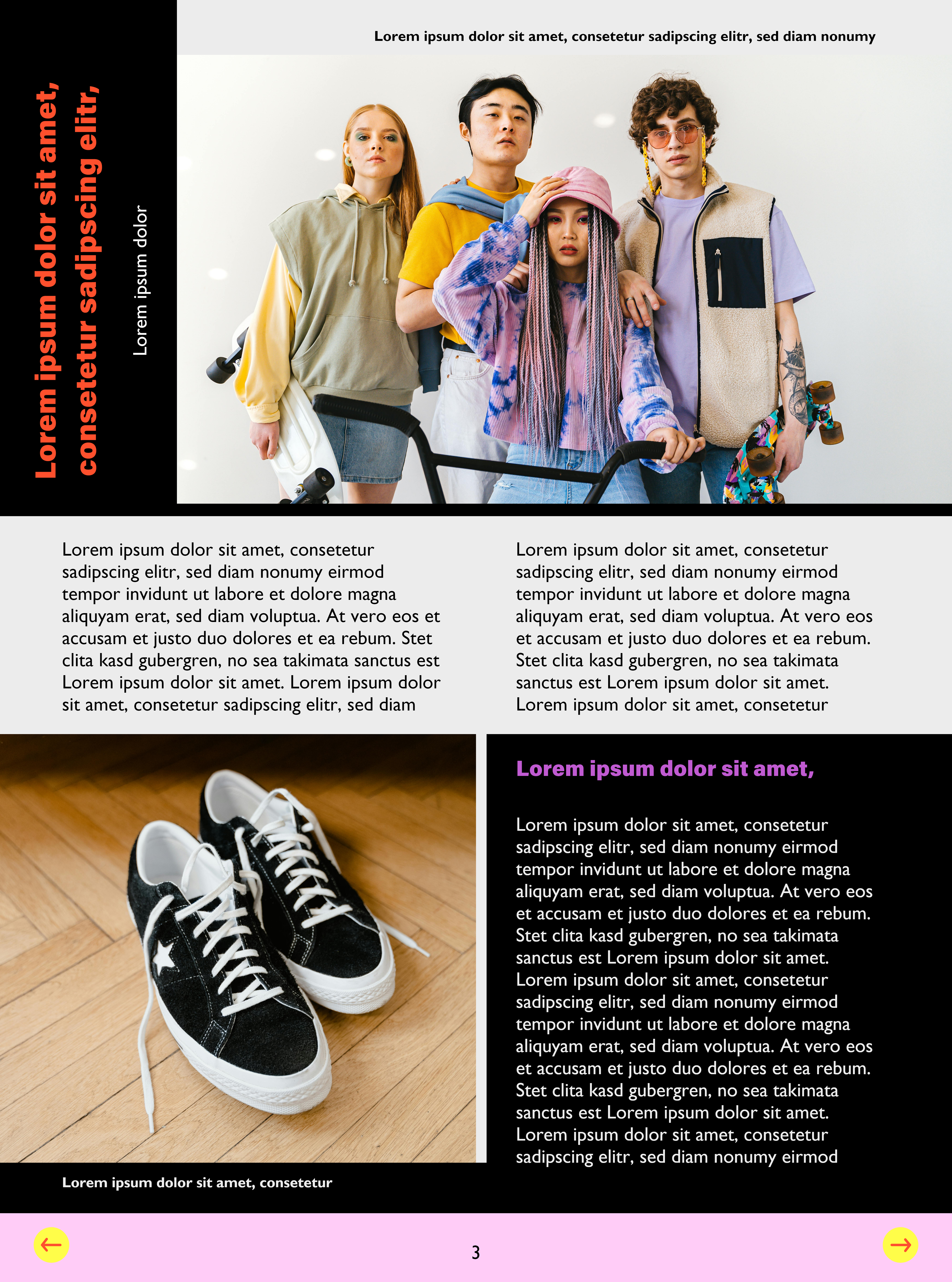
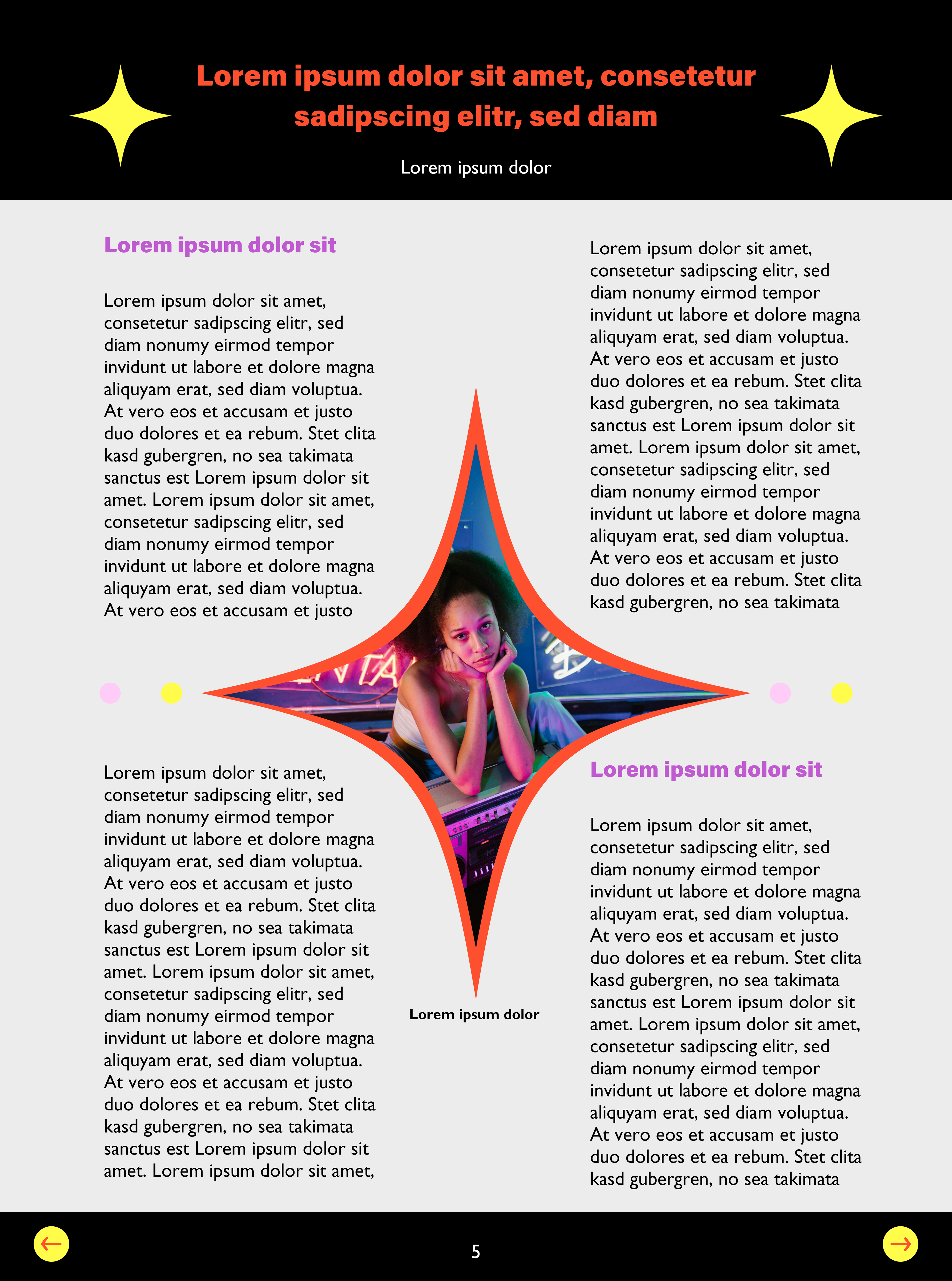
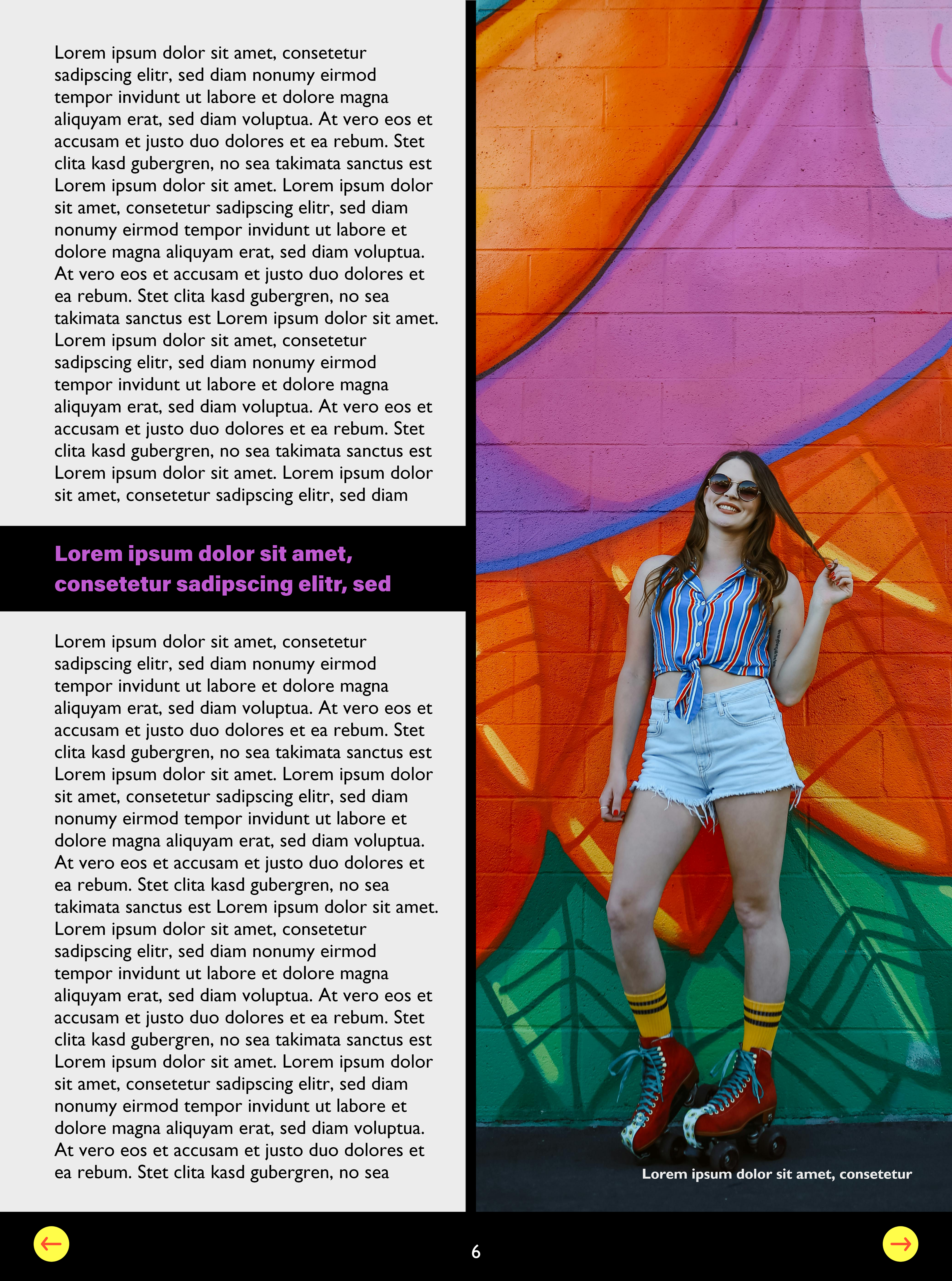
I found stock images on royalty-free websites, like Pexels and Pixabay, and based on the images on the brand board, I chose images that I thought matched the brand’s confidence and aesthetic regarding visuals and vibrant neon colors. Additionally, I added some elements from the brand board, like the star graphic, in multiple places to further tie it to the brand. I also added circular, rectangular, and star-shaped frames for the images and small circular objects to fill extra space and add more color. Lastly, I focused on adding color to parts of the pages. I added the brand’s colors to any place I could while ensuring the colors weren’t too distracting.